
Similar Posts
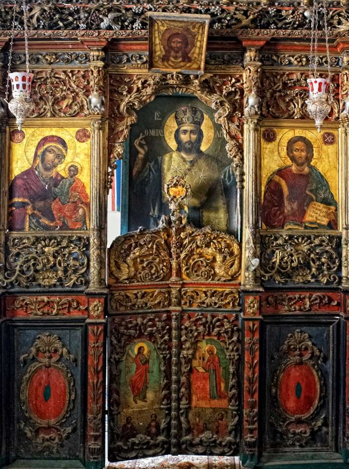
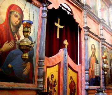
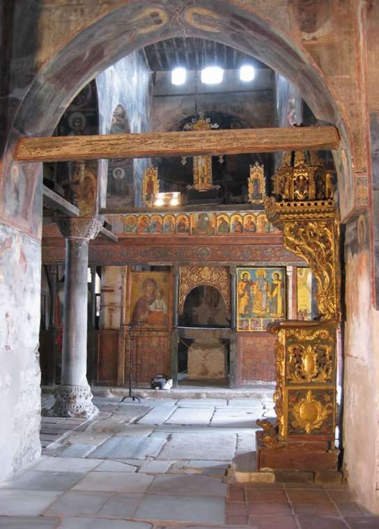
Polychromed iconostasis in a chapel on Mount Athos
Among the traditional liturgical arts, one that stands out as being especially healthy and prolific nowadays is decorative woodcarving. Especially in Greece, workshops produce intricately carved church furnishings in impressive quantities. Almost every Greek church the world over is adorned with a carven iconostasis and matching liturgical furniture. The quality of workmanship varies widely, but I think it is fair to say that even the more ordinary examples of this modern Greek carving are quite lovely, and that they often constitute the finest artwork to be found in contemporary Greek churches. Other Orthodox nations have successfully revived their own styles of liturgical carving, and magnificent carved iconostases now abound in Russia and Romania also.
Nevertheless, I cannot help but observe that there is a striking difference between contemporary Orthodox woodcarving and historical examples from before the 20th century. This difference is color – specifically, gilding and painting. Historic carved wooden iconostases (typically dating from the 17th to 19th centuries) were usually painted in many colors (‘polychromed’) and/or gilded. In contrast, carved iconostases and related furniture made recently are almost never enriched in this way, but rather are finished with clear varnish.
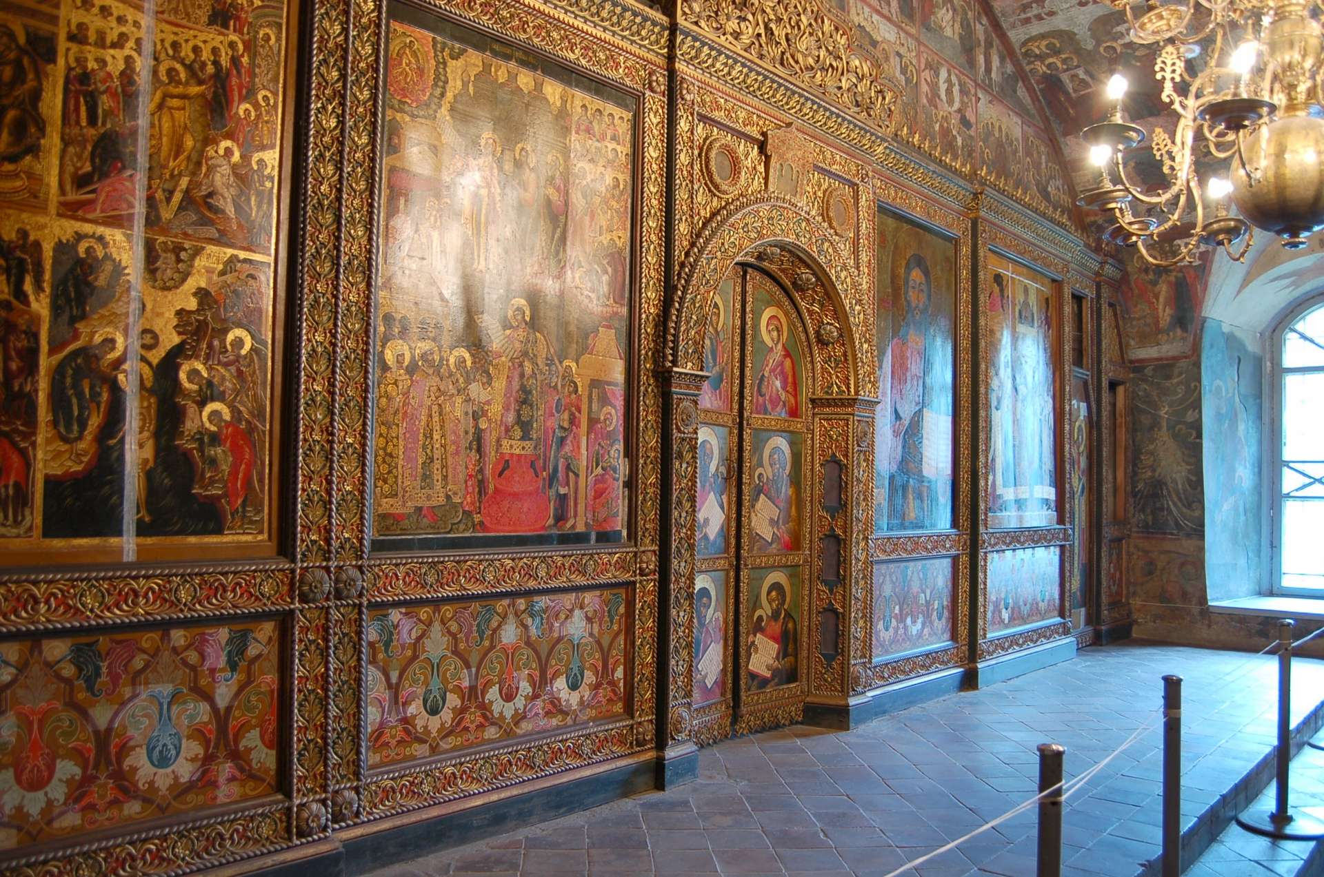
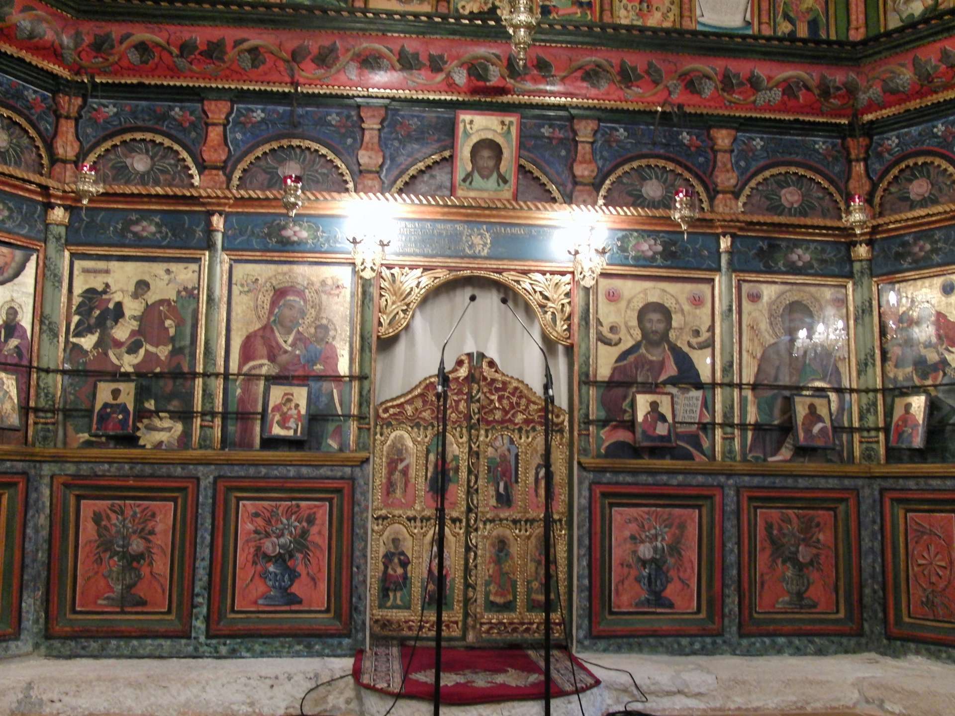
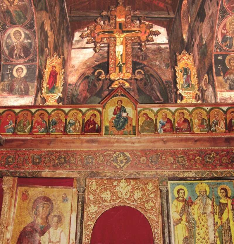
Holy doors, Yaroslavl, Russia, 17th century
In my opinion, the historic polychromed and gilded furnishings are more successful than the modern varnished examples. I do not mean to cast judgement upon the objective beauty of painted versus unpainted wood carving, but rather to consider their visual impact specifically in the liturgical and architectural context of an Orthodox church. In comparing the modern examples with the historic, I find three reasons that the modern ones are problematic:
- Legibility
For ornamentation to be visually satisfying it must be clear and legible in the context in which it is displayed. In an Orthodox church, the iconostasis is viewed by most people from at least 20 feet away. At this distance, the finely detailed carving is quite hard to see. The problem is compounded by the dim and diffuse lighting typical in an Orthodox church. Carvings are highly sensitive to lighting. They look wonderful when lit in sharp raking light, but quite dull when lit face-on or with diffuse light. Thus a carved iconostasis that may have looked great in the carver’s workshop frequently looks underwhelming installed in a church. The ornamentation sometimes becomes so illegible from a distance that it looks like a dull undifferentiated texture.
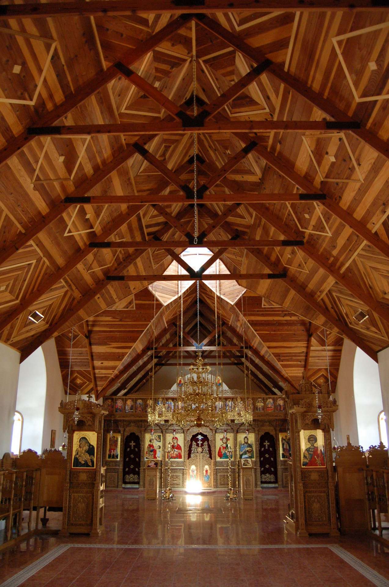
An exquisitely carved modern Greek iconostasis at Saint Anthony Monastery, Arizona

The same iconostasis from a distance. The carving is impossible to read, and appears only as an indistinct dull texture.
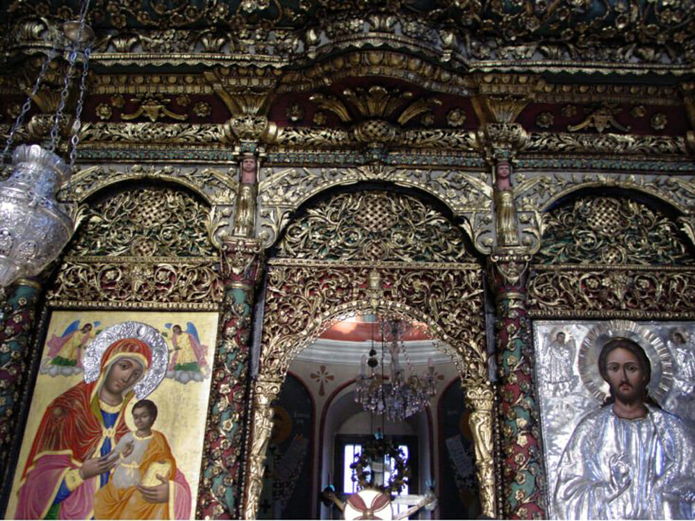
Gilding completely reverses the optical relationship. Gilded carving (which would be downright painful to behold in full sunlight) looks absolutely transfigured in the dim light of a church. The thousands of ridges and concavities are like little mirrors and lenses that pick up flashes of light from every candle flame. The overall effect is one of intense richness mingled with mystery and divine energy. The gilding is usually augmented with colored backgrounds, and this helps the legibility of the carvings – the colors provide a visual guide to the formal hierarchy and divisions within the ornamental panels.
The gilded and painted iconostasis at the Patriarchal Cathedral of St. George, Istanbul.
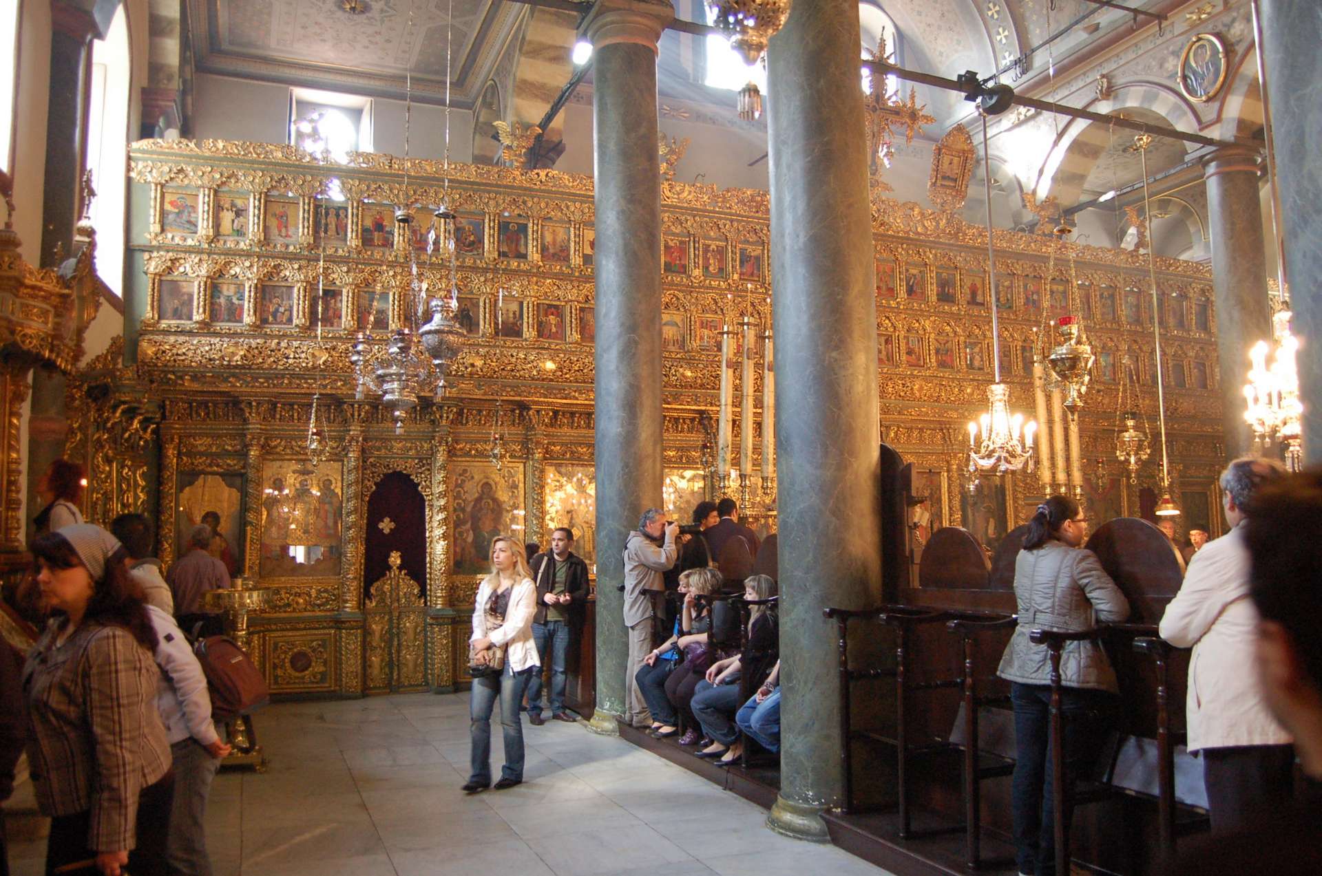
From a distance, this iconostasis seems alive with fiery light and energy, and establishes a magnificent liturgical ethos for the space.
- Integration
A primary visual purpose of the iconostasis is to serve as many icons fully integrated into one icon. It should appear as a window into heaven – the saints and angels who surround the altar made visible to our earthly eyes. It should not appear as an opaque wall with several small ‘windows’ (icons), but as a wall that is completely transparent to heaven, through which the glory of God shines uninhibited. This intention is clearest in the medieval Russian iconostases, which are essentially just rows of icons touching icons. What little structural frame is visible is painted or gilded to make it discreetly blend in with the icons as much as possible. Thus the whole ensemble reads not as a wall, but as one big icon.
The 15th-century iconostasis in Holy Trinity Cathedral at Serguiev Possad, Russia. Typical of early Russian screens, the structure between the icons is as discreet as possible.
Starting in the seventeenth century, the structure of the screen itself became more elaborated and the icons became smaller. This is in some ways regrettable, and is symptomatic of the general decline of iconography. Nevertheless, those post-medieval screens are highly successful visually. Because the structure is intricately carved, painted, and gilded, the woodwork integrates perfectly with the icons. There is still the sense that icons and screen are one and the same – they share the same materials and colors, and they still impact our senses as one great glittering vision of heaven.
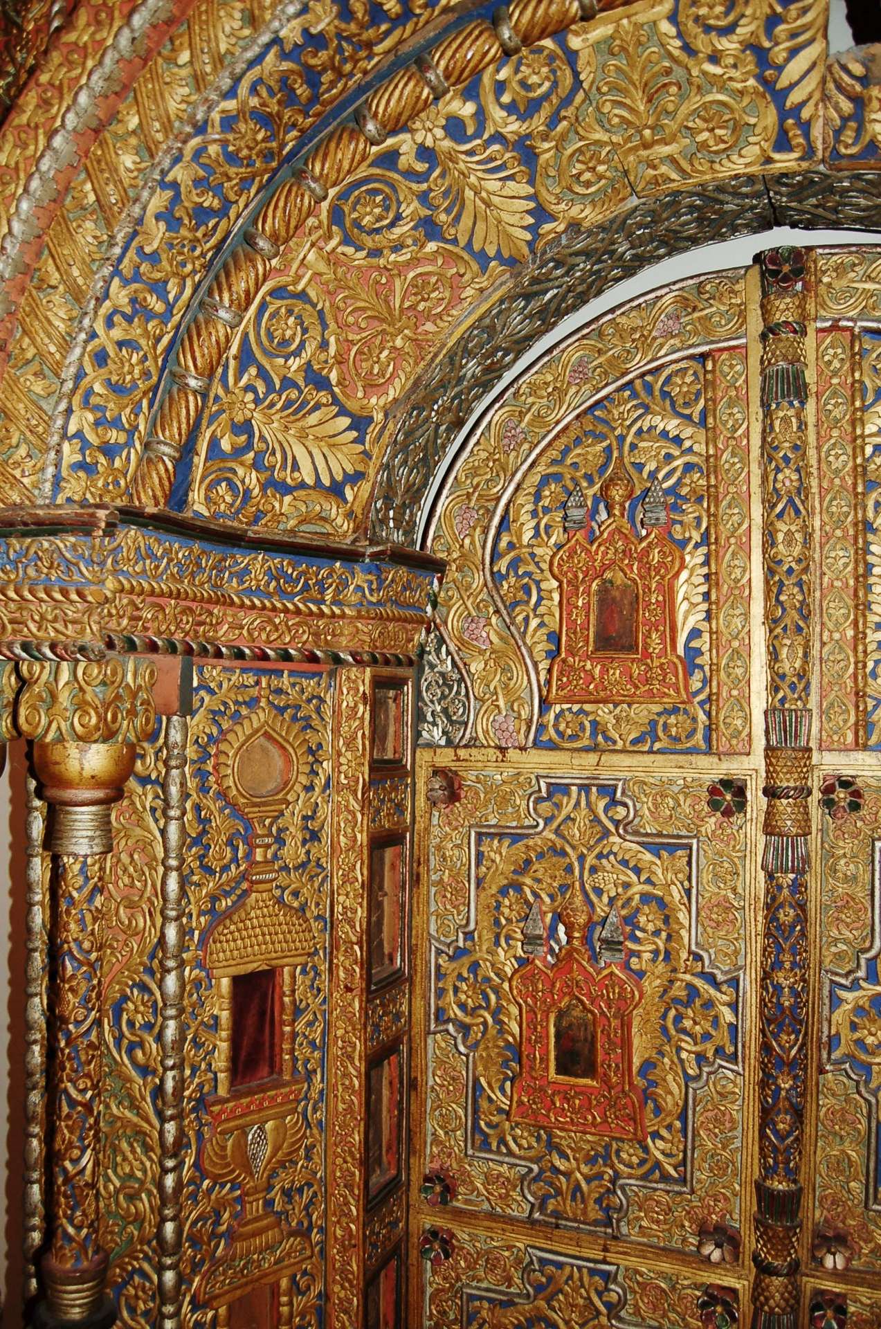
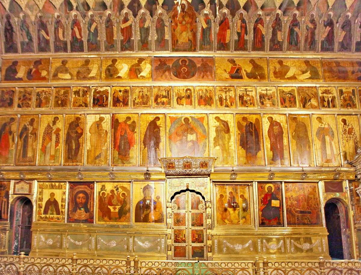
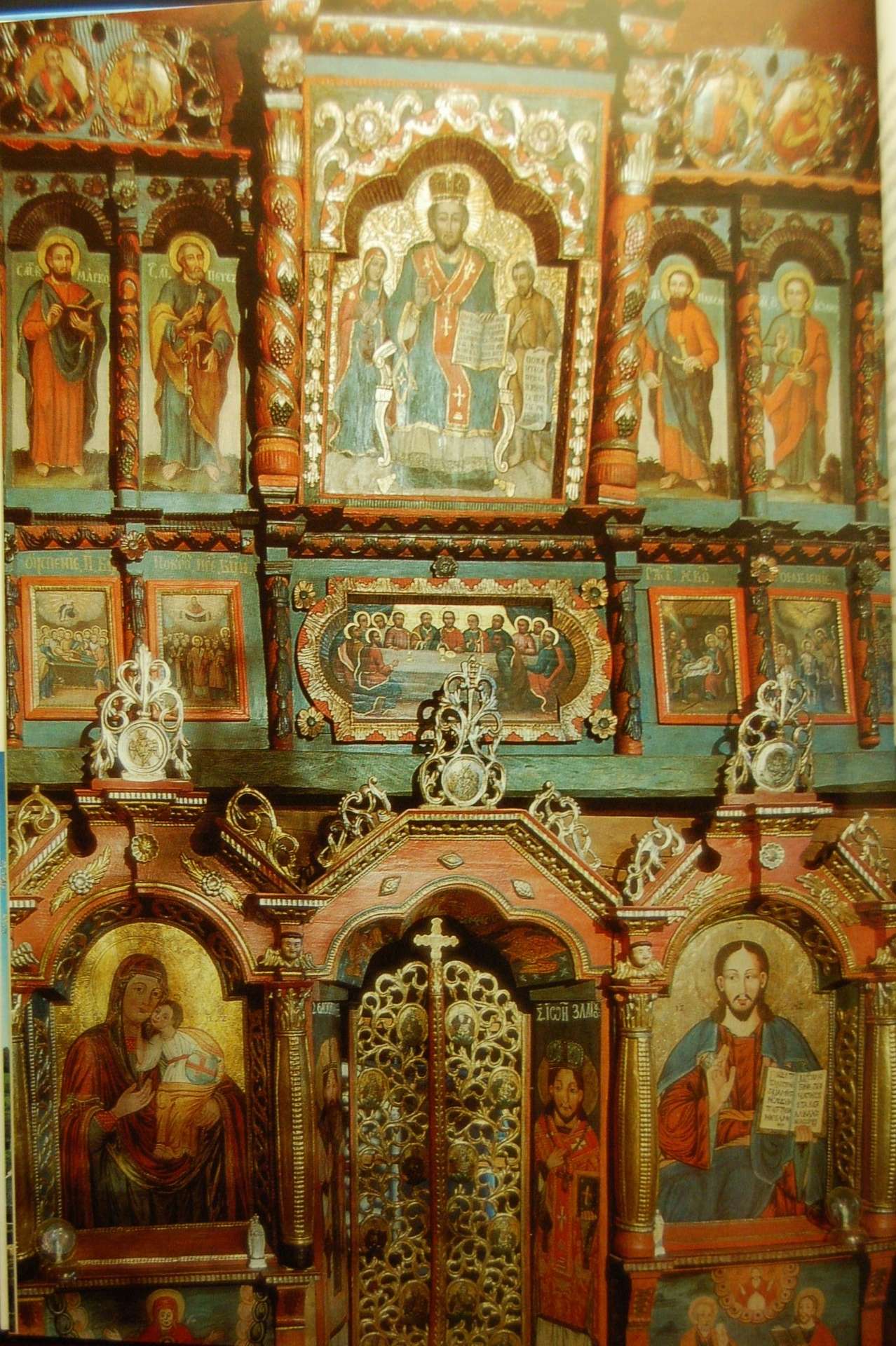
17th-century carved and polychromed iconostasis, Yaroslavl, Russia. The decorative colors used on the carving exactly match the colors in the icons.

Detail of the above screen. Notice how the colored backgrounds between the raised gilded carving help to visually organize the complex decoration.
Xinovrysi, Greece, Dormition Church. This screen, made in 1819, has an unusual dark color scheme which perfectly integrates with the dark palette of the icons.
In contrast, varnished woodcarving does not integrate very well with icons. A carved and varnished icon screen can, at worst, look like an opaque dark wall with the occasional icon mounted on it. Though the carving may be beautiful in and of itself, if that beauty does not visually unite with the holy figures in the icons, then it is hard to see that beautiful carving as part of a window into heaven. It reads more like a giant picture frame – a boundary to the iconic windows, rather than an extension of them.
This problem of visual non-integration is much worse in some instances than in others. I have noticed, for instance, that carved iconostases finished in a light golden color integrate much better with gilded icons than iconostases finished with a dark stain. Also, iconostases that have large icons relatively close to one another integrate much better than those which hold small icons separated by large areas of carving. I think it is fair to say that the higher the ratio of structure to icons, the more important it is that the structure itself appear icon-like.
The Iconostasis of the Church of Saint Basil the Great, Curtea de Arges, Romania. This is a successful icon screen, because the warm gold color of the wood integrates well with the icons, and the simple design of the screen does not distract from the relationships between the icons.
The virtue of integration applies to other furnishings as well. Stasidia, for instance, are frequently placed in front of walls that are frescoed with iconography. Older stasidia are sometimes painted in colors that blend with the frescoes, and thus they look rich and beautiful without calling great attention to themselves. If the stasidia were unpainted, they might look more like a visual obstacle in front of the murals. But of course, this is all dependent upon context. A bright new church with white walls will look best with plain wood stasidia.
Old painted stasidia from a monastery in Moldova.
- Hierarchy
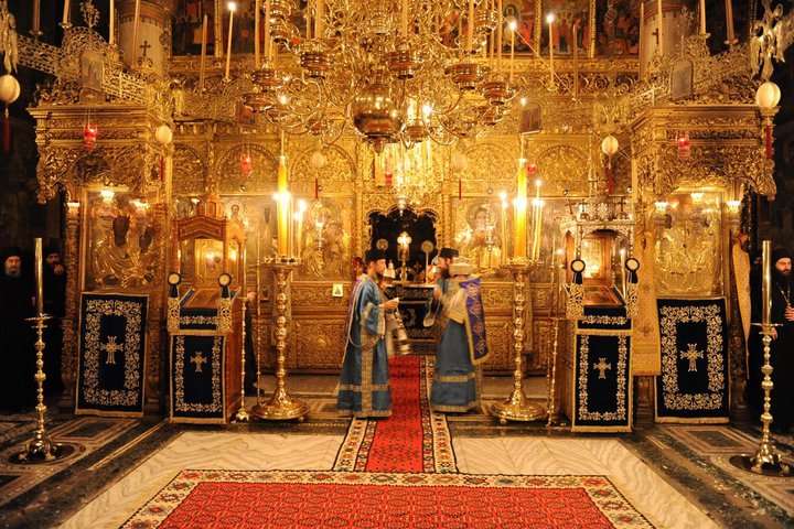
Liturgical art has a visual hierarchy. It shows us what is important by means of visual richness – color and ornamentation. Traditionally, the iconostasis is the visual focus of the church. In a sense, the iconostasis serves as a visual herald for the altar. The altar, the liturgical heart of the church, is small and mostly obscured. Therefore the iconostasis serves to proclaim its glory – like a procession with banners and trumpets marching before a king hidden in his carriage. An iconostasis gives a church its liturgical orientation, and is the focus for the worshippers during most of the service. It must be the richest and most splendid surface in its architectural context.
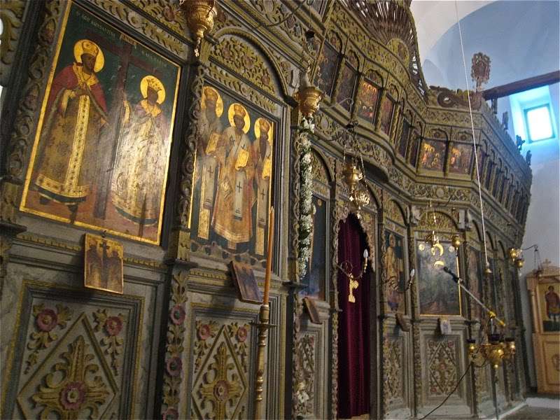
17th-century polychromed screen, St Nicholas of the Roof, Kakopetria, Cyprus
A gilded and painted iconostasis will almost certainly achieve this distinction. But an unpainted iconostasis may struggle to achieve visual preeminence. If the church walls are richly painted, and the iconostasis is but one of many pieces of carved furniture, it may not appear sufficiently prominent.
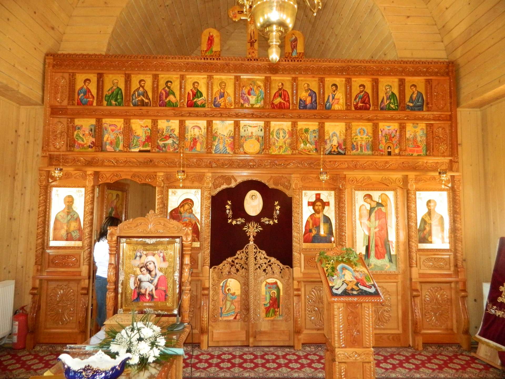
Modern Greek iconostasis at St. Anthony’s Monastery, Arizona. The dark carved wood looks dull and indistinct from a distance and in dim light, so the iconostasis fails to achieve visual dominance. In contrast, the bold parquetry patterns in the wooden ceiling are highly legible, and thus the ceiling, not the altar, is inevitably the focus of this church. This example also shows how a dark wood iconostasis can serve to separate the icons from one another, as each icon appears isolated against the dark framework. If this iconostasis were gilded, both problems would be solved.
Having presented these observations, we may ask what are the reasons for which wood carving is nowadays rarely painted or gilded? I would suggest the following explanations:
- Logistics
Ecclesiastical carvings are made in workshops that produce them in some quantity and ship them all over the world, where they are assembled on site. Gilding is fragile and gilded wood is hard to ship and difficult to handle. And polychrome painting is sensitive to the color-context and lighting of the specific church building, so it must be done on site and in collaboration with the iconographers. Thus it is not in the interest of these workshops to offer painting and gilding as options.
- Cost and Effort
Gilding large areas of carved wood is quite expensive. Polychrome, though less expensive, is almost a dead art, and it is hard to find artisans qualified to do it. If budget is limited, it would probably be better to pay for less carving and reserve some money for gilding or painting. But this would mean the church must hire multiple artisans and give them time and space to do their work. It is much easier to spend all the money on extensive carving and receive the finished pieces ready-to-go out of the crate.
- Discomfort with Color
It is apparent that something has happened to our sense of color in the modern age. In past centuries, every type of building, furnishing, and clothing was richly colored. But in the nineteenth century, color began to be associated with the lower classes. Modern ‘good taste’ meant simple understated colors, and ever since about 1810, no gentleman or businessman would wear any clothing that wasn’t white and black. The splendid coloration of old lived on only among peasants and gypsies, and became an embarrassment to progressive society. Fortunately, we have outlived this overt prejudice, and it is now fashionable to ‘love’ color. Nevertheless, we have lost the intuitive ability to work with color. Very few people nowadays have the skill to select good rich colors for any decorative purpose, and most people are mortally frightened of trying. Furthermore, color is immensely divisive when too many people have a say about it. Opinions about color tend to be expressed with stubbornness and ego, and it is quite impossible for a committee to select a good color scheme.
Icon screen in a chapel on Mt. Athos. It would be very hard for modern Americans to choose such bold, and yet beautiful and harmonious, colors.
- Love of Natural Materials
Our culture has reacted against the artificiality of the modern age by cultivating a special appreciation of natural things. In the old days, wood was ubiquitous in people’s lives, and they delighted in covering its ordinary brown color with bright paints. Nowadays, things handmade from wood are special and rare, while bright color has become the characteristic of plastic junk. So it is understandable that we specially revere the natural beauty of wood in ways that people historically did not. (But all things must be kept in proper proportion. Appreciation of natural beauty is a very good thing, but not all woodwork is made for the purpose of being appreciated. In a liturgical context, there are sometimes aesthetic concerns that must take precedence over the beauty of wood.)
St Demetrios in Diavata (near Thessalonica) – iconostasis made in 1853.
Conclusion
As with all matters of art and Tradition, it is important not to make a dogma out of a mere observation. So I do not wish to present any of these thoughts in order to condemn unpainted ecclesiastical woodcarving. But I am suggesting that a more careful study of historic examples may show us a way to improve what we already do well. As practical advice, I would offer the following:
When considering whether to purchase carved furniture for a church, consider first the lighting. If the lighting in that location is dim, diffuse, or face-on, unpainted carving is not likely to look very good. In such a case, consider gilding the carving, or using some other ornamental technique besides carving. Some of the most successful iconostases have no ornamentation at all, but just a simple flat framework made from wood with good grain and color. If the icons are large and fine, it is sometimes best to let them speak for themselves.
When choosing a design for carved furniture for a larger church, choose large and bold carvings that will be legible from a distance. And when designing an iconostasis, remember that the focus should be the icons. The icons should be as large as possible, and the carved wood should be limited to a modest amount of structure around the icons, and to the decorative panels above and below them. The shapes of the iconostasis should lean towards square and simple. Too many arches and columns make the woodwork look heavy, and overwhelms the icons.
Consider carefully the color of the wood and finish. A light golden color is almost always best. Golden wood integrates well with gilded icons, and gives a warm welcoming ambiance to a church. And carving displayed in dim light has a much better chance of being seen if the wood is light rather than dark. There are very few instances when dark wood or dark stain would ever be advantageous in the context of an Orthodox church.
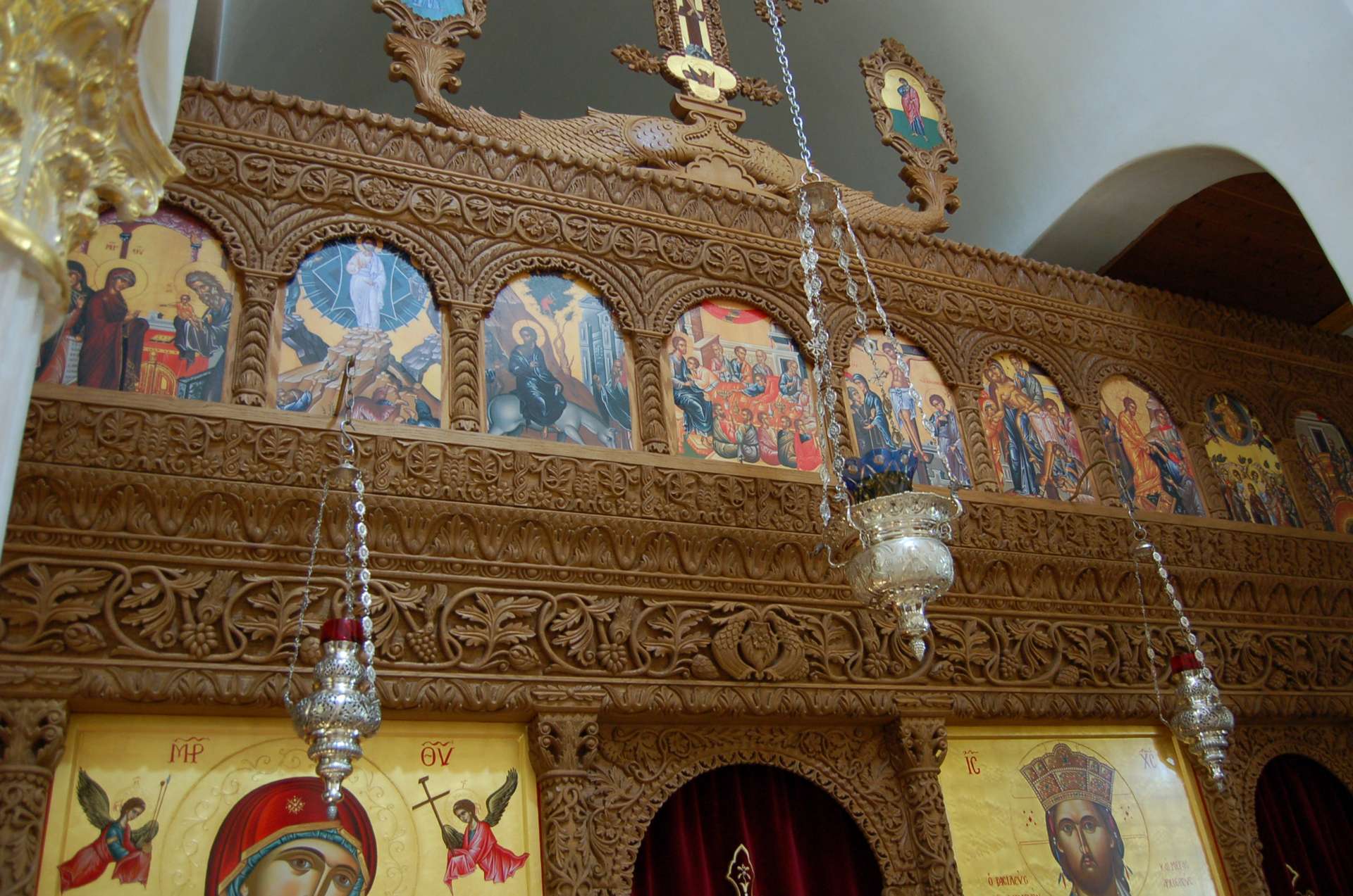
Consider also the type of wood and its grain. Most modern carving is made from basswood (known as limewood in Europe). This wood is quite boring with no visible grain. Thus it really only looks good if it is completely carved (and better yet, gilded and painted). On the other hand, woods with rich grain do not require carving to look beautiful. (In America we have a very special tradition of furniture made from fine hardwoods. So I think there is justification here for making furniture out of woods like cherry, butternut, or figured maple, and leaving them mostly uncarved. And certainly do not ever use stain, which obscures the grain and prevents the wood from ever achieving its natural patina over time.)

Contemporary iconostasis in Russia. A limited use of color preserves the beauty of the wood, while tightening the relationship between the carving and the icons.
And of course, consider gilding and polychrome. Even if a particular iconostasis seems fine without it, or even if the cost of doing it seems impossible, there may still be a great advantage to adding some bit of color. For instance, backgrounds of certain carved areas could be colored red, and certain special details could be gilded. A little polychrome can go a long way.
Part Two of this article describes a recent project undertaken by Andrew Gould to apply polychrome to a Byzantine-style carved wood analogion.
An charming painted iconostasis in a Carpatho Russyn log church, Slovakia.
A carved and gilded iconostasis has such presence that it can maintain visual dominance even when crowded behind furniture and lamps. Hilandar, Mt. Athos.
An old painted iconostasis in an ancient Byzantine church, Nessebur, Bulgaria.
Detail of the above.
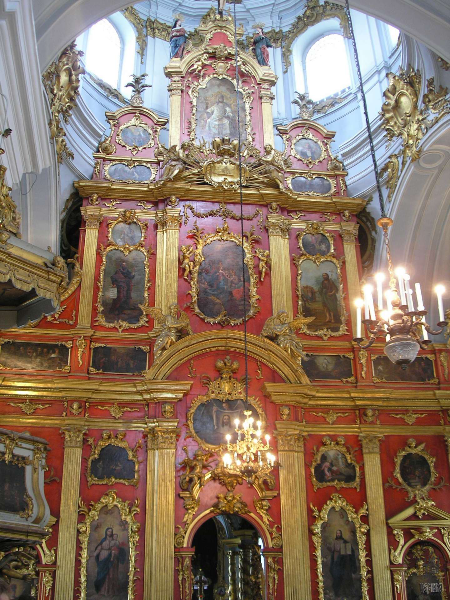
A late-Baroque iconostasis, St. Andrew Cathedral in Ukraine. This screen represents the low-point of iconography, where the images have been reduced to small western-style paintings of an almost purely decorative nature. But the screen itself, painted fiery red and gilded, still conveys much of the divine spark and liturgical ethos of earlier screens. This goes to show the value of a magnificent screen, and its ability to work wonders for a church, even if the icons it holds are of little merit.
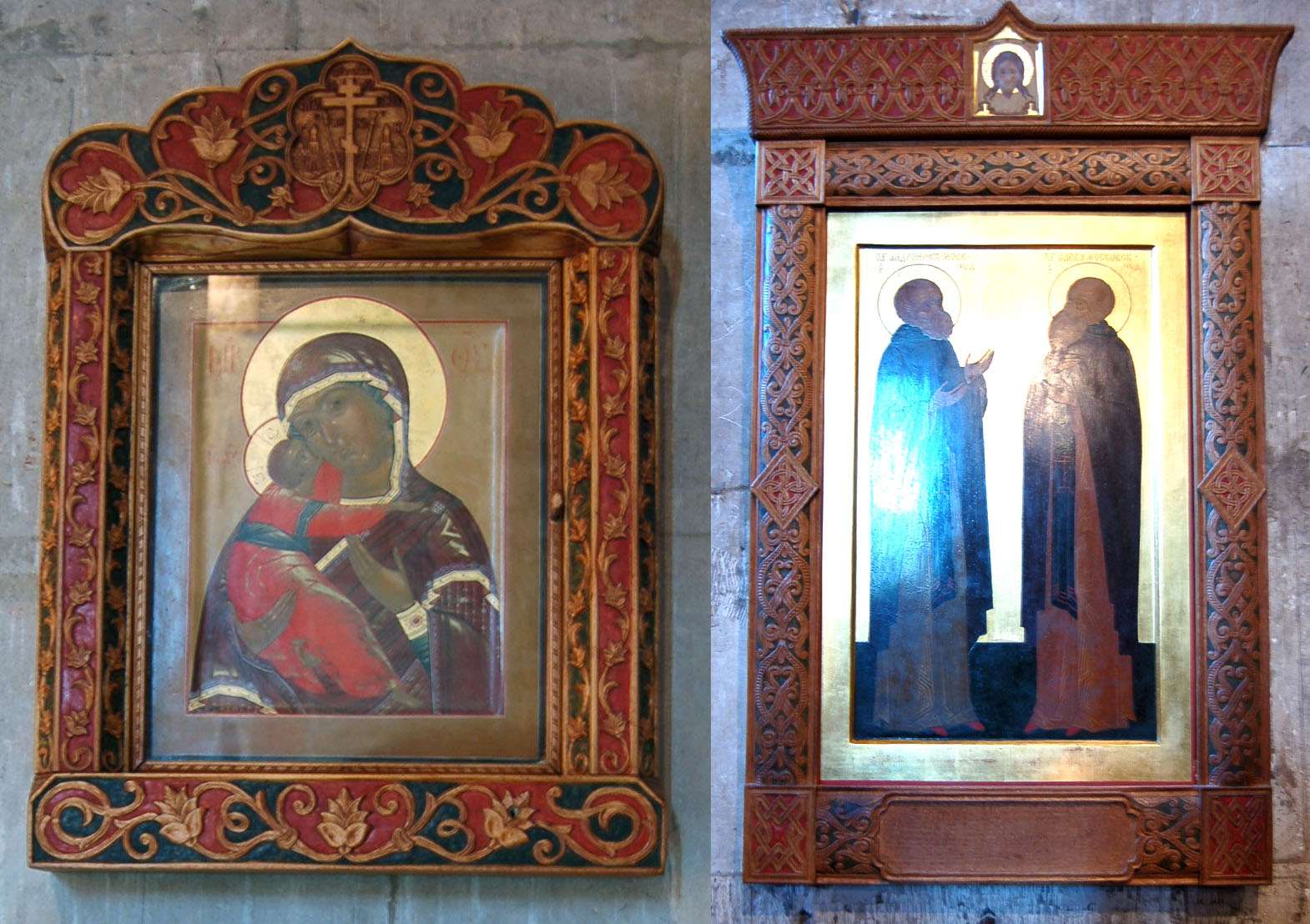
A pair of contemporary carved icon frames at the Andronikov Monastery in Moscow. Notice how the colors used to highlight the carving coordinate with the colors in the icons.
Iconostasis at St. Demetrios, Armolia, Chios, 1840
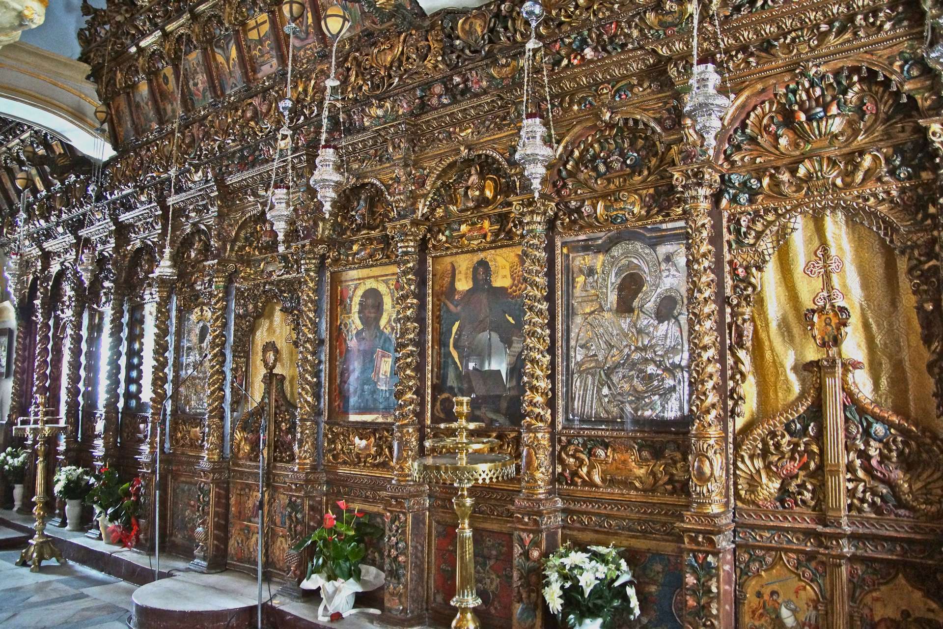
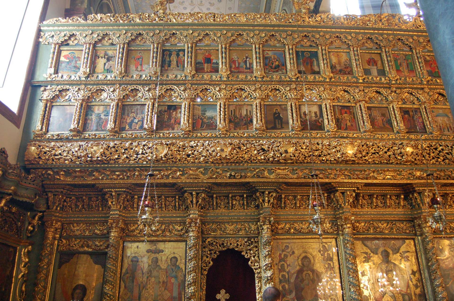
17th-century iconostasis at the Monastery of Panagias Tourlianis, Mykonos, Greece. A tour-de-force of carving, gilding, and color.

Detail from the above screen.
Andrew, thank you for such an enlightening article, succinctly written and copiously illustrated to convey possibilities for enriching appreciation of the role of the iconostasis for the worshiper. I look forward to part 2.
This is definitely a lesson for me, and I am paying attention, though as you mention, I happen to be of those daunted by color in carving, mortally frightened. I need to spend more time looking at the pictures you post to work out my eyes. Thanks and I can’t wait to see the next article.
[…] Part 1 of this article, I gave examples of historic Orthodox woodwork decorated with polychrome, and […]