Similar Posts
(This is the second part of a two-part article. Click here for the first part.)
3. SOME PRINCIPLES BEHIND THE FORMAL QUALITIES OF ICONS
Affirmation of matter and form
There has been some mistaken writing about iconography that associates transfiguration with dematerialisation. This is a Doscetic heresy. Icons depict a material world transfigured, not dematerialized. So icons must therefore show a profound understanding of and respect for the form of the material word as God has created it. Although we are in a fallen world, the lineaments of this world nevertheless remain incredibly beautiful and divinely inspired.
In order to affirm this two-fold aspect of the transfigured world – its material form and spiritual grace that transforms it – the Byzantine icon tradition seems to have drawn inspiration from earlier epochs. According to George Kordis, who has studied this field much more than myself, the Byzantine tradition used techniques from the Hellenistic period to achieve plasticity, movement and rhythm, and from the more expressive Late Antiquity it learned the use of line and colour to construct form, vertical perspective, linearism, and compositional method.
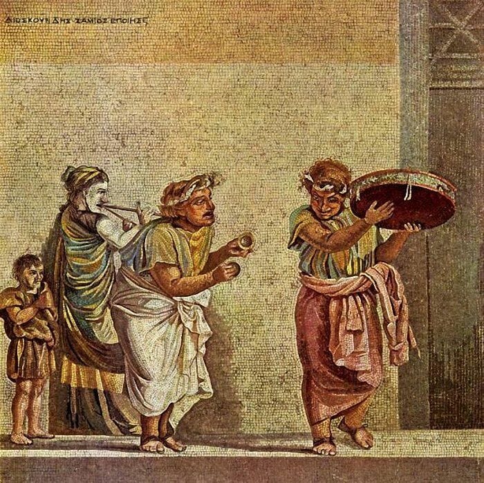
An example of Hellenistic art, showing its developed modelling of form and movement. 1st century BC Copy of a Hellenistic mosaic, produced by Dioskourides of Samos found near Pompeii (Villa of Cicero).

An example of Late Antique art, showing a more abstract arrangement of forms, such as vertical perspective. From the Arch of Constantine c. 320 AD, Rome.
In his own words:
Byzantine iconographers…instead of devising their own solutions, they turned to the great inheritance of classical and Hellenistic art as well as to that of late antiquity. It was the art of these periods that provided them with the answers they needed. Taking away depth, and using line and local colour to construct a form in sculpture or painting, was a technique already prevalent in the second century AD…It was from this important period, the expressionism of late antiquity, that they borrowed the vertical system of perspective, linearism, and of course compositional method. However, Byzantine iconographers also sought to express movement and rhythm in their art. For this they looked at the classical naturalistic tradition, from which they borrowed…plasticity, the dynamic manner of drawing figures on the surface, and the philosophy of rhythm. They took their fundamental artistic principles from these two main sources and used them to construct their own artistic system.[17]
Asceticism
St John Maximovitch wrote:
The task of the iconographer is precisely to render, as far as possible and to as great an extent as possible, those spiritual qualities whereby the person depicted acquired the Kingdom of Heaven[18]
An icon should therefore inculcate a sobriety that leads the viewer toward repentance. A well painted icon does not impart aesthetic delight without also offering the means of the venerator becoming themselves beautiful. This is why faces possess their characteristic bright sadness, a mixture of joy and sorrow, a compassionate peace. One brow is often softer in curve, while the other is more arched. One cheekbone is more sunken or pronounced, while the other is gentler of curve. The regard of the face is attentive without being tense.
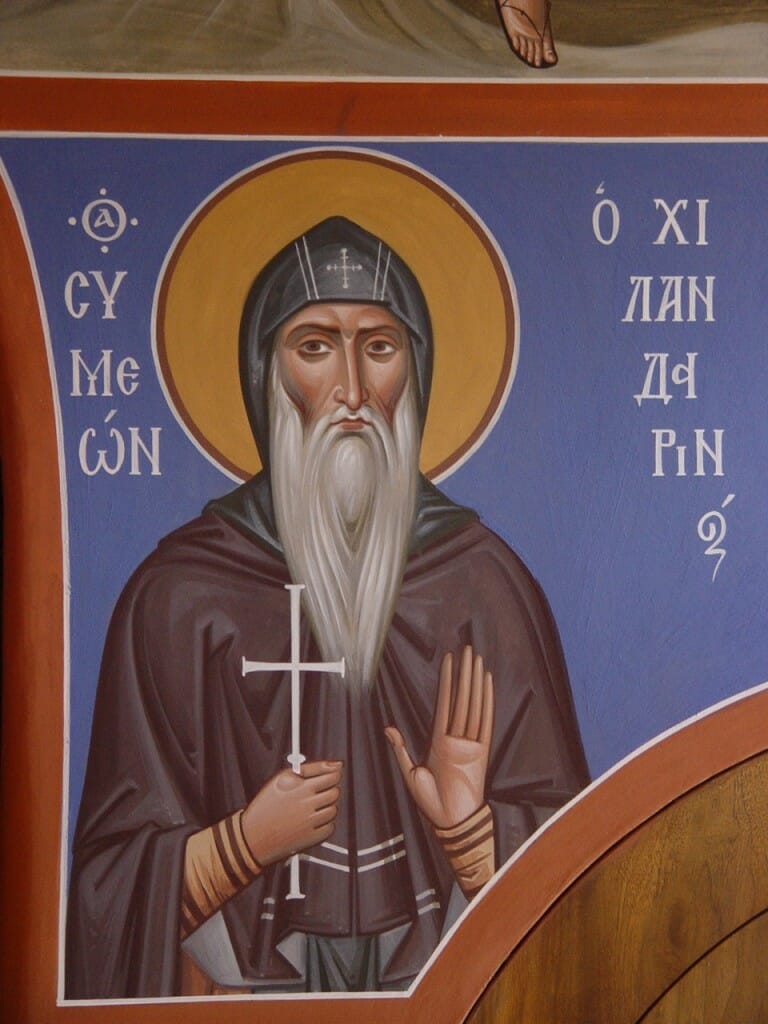
19. St Simeon of Chilandar. Wall painting in Simonopetra, Mt. Athos, by Archimandrite Zenon. The face shows a union of serenity, ascetic struggle, joy, and sorrowful compassion.
Asceticism means training, the stripping away of superfluous weight so we can run the good race. An icon therefore strips away superfluous decoration and detail in order to focus on the content and to engage the viewer with the saint. Although there is movement, there is no agitated, wasted movement. The saint concentrates on us, is focused, is in a state of prayer and listening.
Any embellishments – be they decoration, buildings, furniture or landscape – need to act as a throne to support the all-important figures depicted, and also to crystallise or articulate the spiritual dynamics of the event. The mountains in many Theophany icons, for example, seem to part like the waves of the Red Sea, or the structure behind Mary in the Annunciation icon might indicate her role as temple, door, throne or veil. These types are mentioned in the liturgical texts, so that image and word are in synergy.
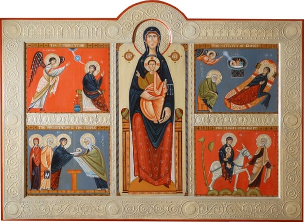
Feasts of the Virgin, by Phil Davydov and Olga Shalamova. This icon shows a very modern reduction of background detail and decoration to a minimum, whilst retaining the essential symbolic elements.
Perspective
In writings about icons one hears much about the so-called inverse perspective. There are in fact numerous other techniques also used. Apart from inverse perspective we have: flatness; multi-view; isometry (in which lines remain parallel); hierarchical (more important figures are enlarged); deliberately enigmatic (somewhat like the famous M.C. Escher illustrations): and sometimes also, mathematical perspective in which the vanishing point lies on the horizon. This last method has never been applied rigorously and throughout the whole image, as was done in the Renaissance period and after.
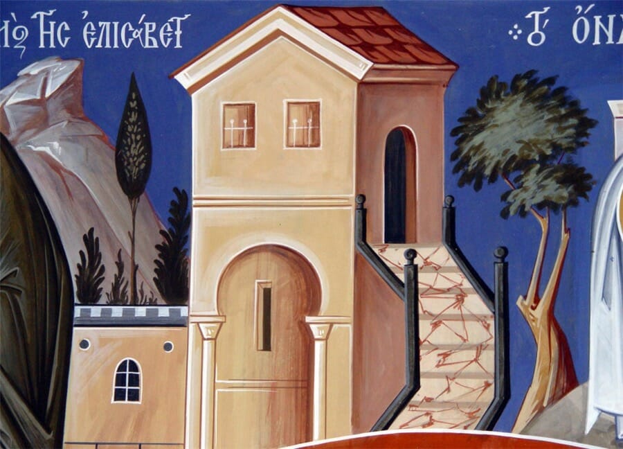
Detail from a wall painting, showing some of the forms of perspective used in iconography: multi-view, inverse (the roof), enigmatic (the stairs). Simonopetra Monastery, Mount Athos, by Archimandrite Zenon.
Broadly speaking there are three schools of thought (not necessarily mutually exclusive) offering explanations why these various perspective systems are used in icons.
That which teaches the mystagogy of style (as discussed above) says that these techniques help us to see the world in a more divine way.
The ‘psychological’ school denies the need for any spiritual explanation, and says that these abstract means correlate with how we actually experience what we see, and not just how our retina receives them. For example, we know that a building has sides as well as a front, so even if our eyes do not see the sides, our mind nevertheless registers them as there. Multi-view perspective therefore represents our subjective experience more accurately than the mathematical vanishing point system.
The liturgical school asserts that the mystagogic explanations are too esoteric, are not Orthodox, and are not mentioned in any patristic writings. This school avers that the purpose of iconographic perspective is to ensure that the icon draws the devout viewer to share in the reality depicted and to ensure the image is participant in the liturgical life that is its natural and intended setting.
This school points out that symbol in the traditional Christian context does not mean a mental reminder of some reality but rather a means of participation in that reality. It means, as its Greek roots implies, a bringing together (sym – bolis) of two parts. This is certainly true, but using this to criticize the essentialist school makes the assumption – mistaken I think – that the latter understand iconographic abstractions merely as signs to be read mentally and consciously. My own view is that – at least some of – the various abstract forms found in icons act directly on the soul to help create a state more receptive to the Spirit. These stylistic constructs can act somewhat like the modes of traditional Byzantine, Russian or Gregorian chant, that are designed to help carry the words deeper into the soul as well as to support liturgical worship.
Enigmatic perspective for example, as in the non-sensical staircase in the work illustrated above by Father Zenon, is difficult to explain in terms of liturgical participation only. A more natural explanation would be that its inscrutable nature is designed to confound our rational faculty and thereby help us to accept that there are some things beyond our comprehension.
The fact that some of these techniques of abstraction were adopted and adapted from non-Christian art forms makes no difference. The Church has always sought for and affirmed truth wherever it is found. One scholar, for example,[19] lists 28 instances of the Apostle Paul either quoting from, or making statements clearly paralleled in, Greek and Roman philosophers and writers, including Euripides, Seneca and other Stoics, Aratus, Aristotle and Plato.
Personally, I think all three explanations for abstraction in icons have a part and are not mutually exclusive. They are valid since all three are rooted in the realities of God’s world. One interpretation does not exclude the other. Either way, the iconographer needs to know these perspective systems and know how to use them.
Non-centric viewing
Some of the perspective systems used in icons encourage us to move beyond our self-centric world view and see the world more as God sees it. Multi-view perspective is one such system. An object, such as a building, is shown as viewed from three or more vantage points at once rather from a single viewpoint.
Also, nothing is far from God, and therefore those further away in the field of depth are shown close to us. Icons therefore tend to express depth through the axis of height; someone further away is simply put higher up on the panel, but of the same size of those closer and further down the panel.
Using this technique the iconographer is also able to preserve the flatness or compressed field of depth that is so characteristic of icons. This flatness in turn allows the figures and features to be arranged in a more theologically meaningful way, often using geometry.
Inner Geometry
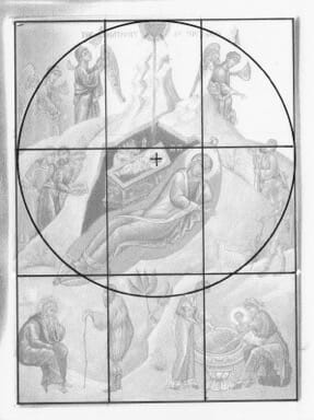
The geometry underlying some icons of the Lord’s Nativity. The lower square contains the earthly participants, the semi-circle the heavenly, while Christ the divine Child is at the centre of the circle which encompasses representatives of all creation: rich, poor, angels and humans, male and female, animals, trees and rocks.
As we have seen, a festal icon can be a commentary on the liturgical texts. One way it can do this is to possess an underlying geometry that elucidates the event’s theology. The individual elements of the scene can be arranged within this structure and thereby create a single whole, whose arrangement and movement interpret the dominant theology of the event.
The somewhat complex icon of the Nativity is a good case.
It can be approached in many ways, but in the illustrated icon I have arranged the key elements in a circle whose centre is the Christ Child. This circle is then combined with a square. All the earthly elements are contained in this square, while the heavenly subjects (the angels and the star) are contained in the top half of the circle. These two shapes are combined to suggest a domed church. The dome represents heaven and the square represents earth. The whole icon is therefore an image of the Church, the body of Christ, God and creation united.
Communion
The icon exists above all to aid communion, communion between the person depicted and the praying viewer.
The face of the saint is therefore usually toward the viewer, or if in a scene or deisis, no more than three quarters view. Sometimes they look at us, sometimes slightly beyond us, as though contemplating something, seeing with the heart and not just the eye: “She pondered these things in her heart” as the Scriptures tell us of the Virgin Mary.
Light
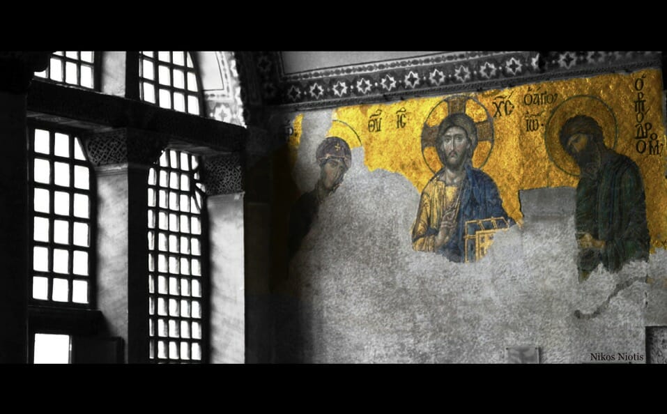
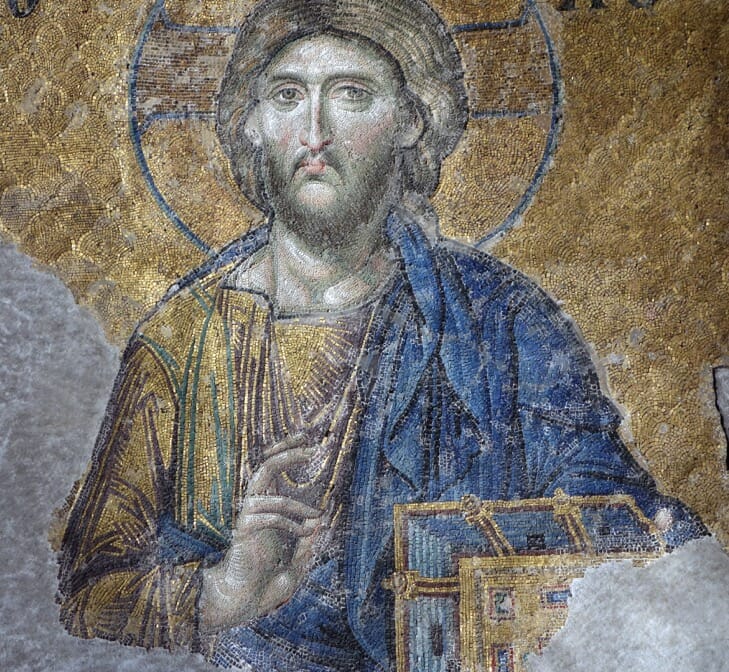
We can identify four sources of light in icons: shining from within the saint; surrounding the saint; light for modelling form; and sometimes, though more rarely, directional light from a single external source. A good example to illustrate all four of these is the famous mosaic of Christ in the gallery of Agia Sophia.
- The halo suggests light radiating from within the person. In icons of Christ He is Himself this light. In icons of saints, the light is from the indwelling Holy Spirit.
- Background gold as in this mosaic, or else a radiant colour such as vermilion, affirms the words of St Paul: “In Him we live and move and have our being” (Acts 17.28). This light is therefore not so much a background as the all encompassing divine “atmosphere” within which all things are sustained and directed.
- Modelling light, to create a sense of The rule of thumb for icon painting is that what is closer is lighter, and what is further away is darker. Or very often it is not so much that the shading is darker but that it is painted with a cool colour, such as green or even blue. Although icons do not use extreme contrasts of light and dark created by a single strong light source (a technique called chiaroscuro), Leonid Ouspensky was incorrect in asserting that icons do not have shadows. There are clearly areas darker than others. This contrast of light and dark is used to suggest the materiality of the subject. It is dangerous to associate spirituality in art with dematerialization.
- What is unusual in the Agia Sophia mosaic is the casting of a shadow on the neck which can only be created by a single source of light, above and to the left of the figure. This is rarely found in icons, but is not outside the tradition. The point in this mosaic is that the direction of the light in the mosaic that creates the neck shadow is identical to that passing through a window to the left of the mosaic. The shadow on Christ’s neck is exactly where it would be if He were standing where the mosaic is. The creator of the mosaic is surely showing us that Christ is present here, in this gallery, in this place. Directional “naturalistic” lighting is thus still used liturgically, and in conjunction with the other three techniques described above.
The iconographer’s way of life
All Christians are called to live the sacramental life of the Church, to fast, to pray, to live according to Christ’s commandments of love. This is also incumbent on iconographers, for if they are to depict Christ, the saints, and the angels, as well as knowing the received tradition of their icons they must aspire also to know them personally. Otherwise they would merely be painting a painting rather than painting a person.
In the world of secular art it is easy to distinguish a portrait made purely from photos from a portrait painted from life. Encounter with the subject helps the artist to discover and indicate the sitter’s character, to discern what is essential and what is secondary. Many small decisions are taken during the making of an icon – where to put a line, what colour or tone to use, and so on. Unless one has the music of heaven within oneself one cannot detect things in one’s painting that are off key.
Harmony with hymnography
The icon is liturgical, designed to be part of the greater liturgical life of the Church. Its content and form must therefore correlate with the Church’s hymnography and with Scripture readings appointed for its commemoration day. This is especially so with festal icons. One should be a commentary on the other. It is therefore essential that an iconographer know the liturgical texts of the feasts.
A good example is the icon of the Transfiguration where, among other things, we often see a cave depicted under Elijah and under Moses.
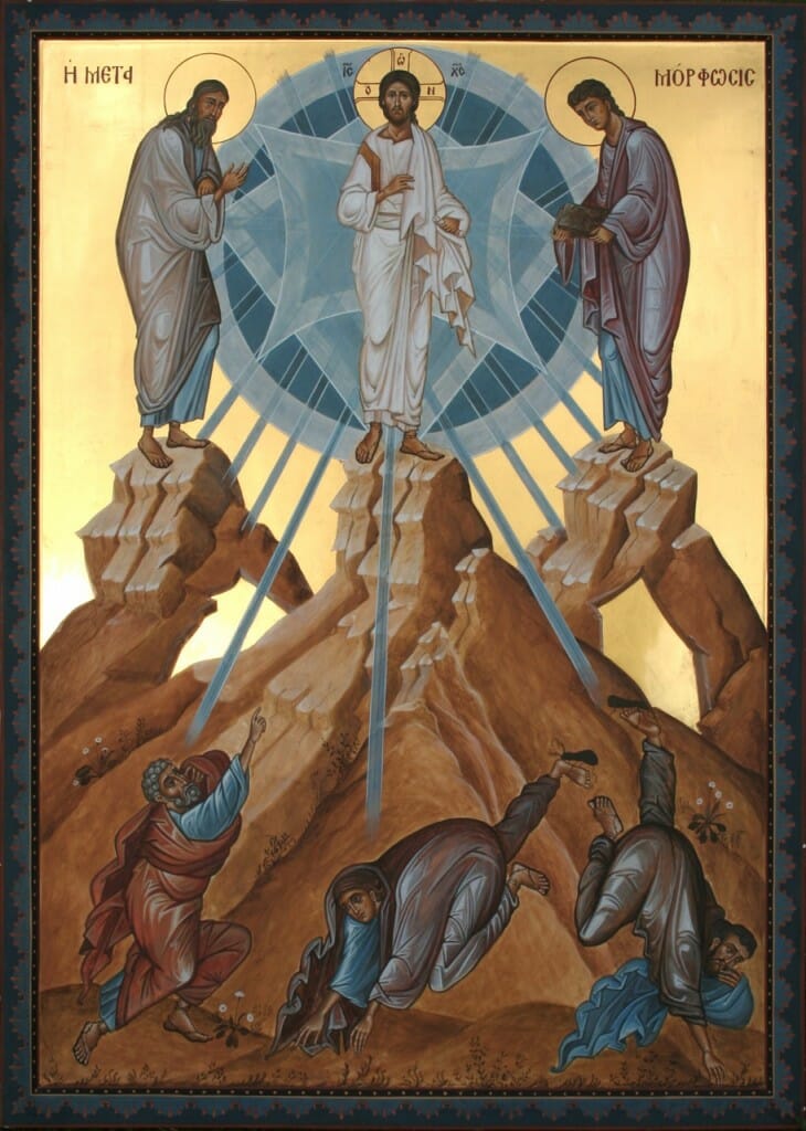
The Transfiguration, showing the caves which are referred to in the Biblical and liturgical texts. By the author.
This stimulates the viewer to wonder why they are there. The Scripture readings for the Vespers remind us that both Moses and Elijah had partial theophanies in relation to caves. Moses is hid in the cleft of a rock and sees only the back parts of God. Elijah hears only a still small voice as he stands at the mouth of his cave. But here on Tabor, thanks to the incarnation of God, they stand outside their caves of partial knowledge and behold the Lord face to face. This contrast is witnessed to by the hymns of the feast:
As for Moses and Elijah, when they conversed with Christ they made manifest that He was the Lord of the living and the dead, and that He was the God Who spoke of old in the law and the Prophets. (Great Vespers)
Appropriate to architectural space
Be it panel icon, wall painting or mosaic, an icon ought to fit the architectural space and lighting for which it is made.
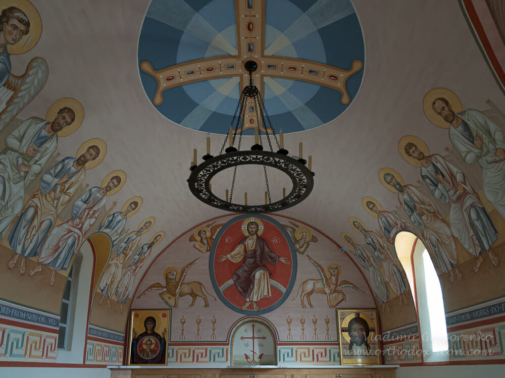
Archbishop Dimitri Memorial Chapel, St Seraphim Cathedral, Dallas. By Vladimir Grigorenko. An excellent example of a wall painting designed beautifully for the given architectural space and its liturgical function. Its theme is the Second Coming since, as the artist writes, it will be “the place of eternal rest for Archbishop Dmitri – the place where he will wait until the Second Coming”
The whole of a parish or monastery’s liturgical life can be considered as a single icon, and so each addition should supplement and complement what is already there. A certain understanding of liturgics, church architecture and art history is therefore required of an iconographer. An icon in a dark corner, for example, might be painted in lighter tones than one on a highly lit space. Or when painting for a British Orthodox church, for example, one could draw inspiration from Romanesque, Celtic or Anglo Saxon work.
Uniqueness of persons
Each of us is unique, a profound mystery, possessing our own name and face. This uniqueness is the presupposition of communion, for unity is not possible without distinction. Icons have often failed to value this uniqueness. Icons of female saints in particular suffer from this, the same face being used endlessly with only the inscription and clothes varying.
The uniqueness of persons is very evident in icons of the first eight centuries of church iconography, such as in the mosaics of the Rotunda (St George’s) in Thessaloniki. But it seems to have suffered after iconoclasm. Faces became more formulaic.
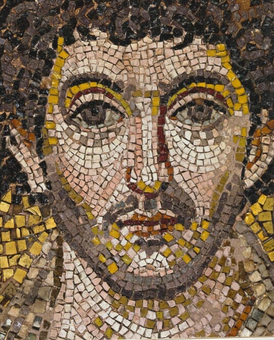
St George’s Rotunda, Thessaloniki. Each face in this ensemble of mosaics, dating sometime from the late 4th to the mid 5th century, reveals a remarkable distinctiveness.
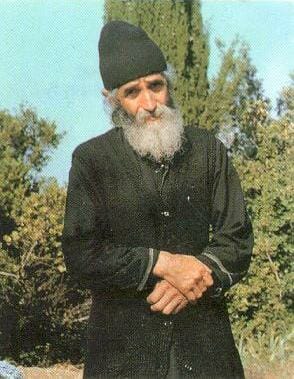
Life-likeness is a particular challenge when we depict saints within living memory for whom we have painted portraits or photographs, such as St Paisius of the Holy Mountain or New Martyr Elizabeth. We need to affirm their physical likeness without becoming naturalistic.
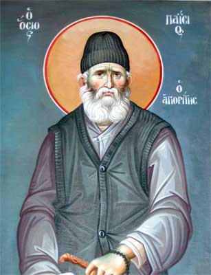
A wall painting of the recently canonized St Paisios. At least those of us who knew him would wish his icons, while not becoming naturalistic, to reflect something of his unique personality.
Harmony
We are unique, but our unique face and personhood is fulfilled in relationship. Our unity arises also from our shared single human nature. There are many persons but one nature. An icon should therefore arrange its figures so that they are in harmony, especially in harmony with the workings of God expressed in that particular feast.
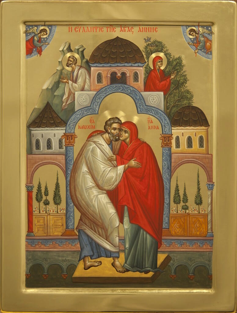
Ioachim and Anna. By Nun Olga, Rumania. An excellent example of an harmonious icon. The colours are rich but harmonious, the detail instructive but not distracting, and the design balanced without being rigid.
George Kordis has an unusual theory on this matter. He suggests that icons can use colour to affirm unity of nature, while line (the icon’s drawing and form) can uphold the uniqueness of persons.
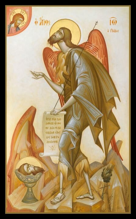
St John the Baptist, by George Kordis. This work illustrates the above point, that colour can create unity, while the drawing distinguishes each element from its neighbour.
An icon depicts a redeemed world, a world where we see God’s hand in all things. In this sense it is prophetical, unveiling God’s hidden purpose in events. An icon is therefore a microcosm in which opposites are reconciled. It ought therefore to possess profound harmony, the elements being arranged in relationship to the boundaries of the panel with nothing arbitrarily cut off. An icon is therefore not so much a window with an arbitrary view, but a door through which all the characters must pass.
Another reason for the need of aesthetic harmony in icons is that the world is an image of the Trinitarian God. A good icon therefore reflects a world in which there is both distinction, as in the three Persons of the Trinity, and equally also unity, for God is one.
The colours should be harmonious, therefore the iconographer needs to know colour theory: how complementary colours work, the action of warm, cool and neutral colours upon each other, and so on.
As many writers remind us, being a liturgical object means that an icon is more than just an art object. But I would assert that it is at least art. It should contain all that a good painting contains, and more. An iconographer should therefore strive to know more about their craft than a secular artist, not less. Most of the patristic writers were highly skilled in rhetoric and pagan learning, and turned this skill to the service of the Church. Should not an iconographer do the same, availing themselves of any knowledge available, regardless of its source?
Authenticity and innovation
Whilst learning from past masters, a mature iconographer goes beyond imitation. Mere copying gives the false sense that to follow Church tradition is to live a mindless, robotic, and fearful existence. If the Gospels and Book of Acts are anything to go by, life with Christ is a rather daring and unpredictable adventure!
Romania is quite a leader in creative contemporary iconography. Situated geographically between Russia and Greece as it is, Romania is in a good position to take the best of both those traditions. They are also a Latin culture, and so feel at home with certain Western traditions. The reader is referred to a splendid article in OAJ on this subject: The New Romanian Masters: Innovative Iconography in the Matrix of Tradition
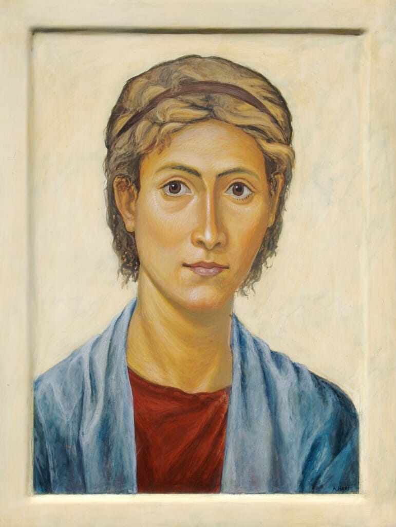
When operating creatively the challenge is how to work within the received language of iconography without changing it so much as to render it unusable for liturgical use. One solution is to experiment initially not with icons but with non-liturgical art, what we might call “gallery art”. After this period of trial, the iconographer then imports into their icons those elements that seem appropriate to a liturgical setting. In the illustrated work below, I wanted to explore how I could paint a naturalistic portrait that, while not being a liturgical icon, nevertheless imbibed some of the ethos of an icon. I was also influenced by the Romano-Egyptian portraits painted in encaustic (melted wax and pigment), that were the basis for many of the first panel icons.
This portrait helped me at a later date to make icons of female saints which were not as generic as before, such as the illustrated one of St Etheldreda.
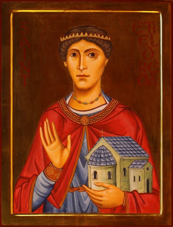
St Etheldreda of Hexham, by the author. In this icon I tried to import some elements from the above portrait, and from early iconography such as the 4th/5th century mosaics of the Rotunda, Thessaloniki.
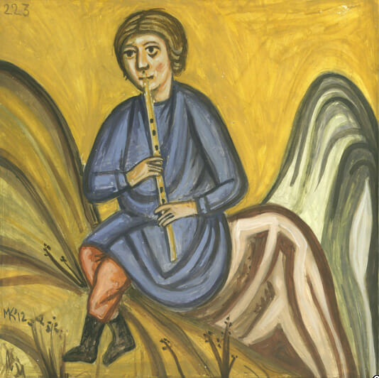
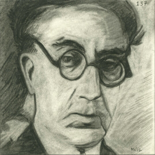
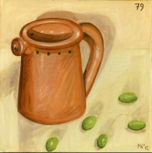
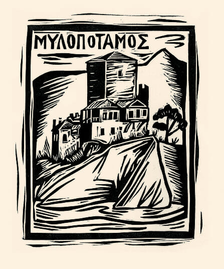
The Greek contemporary iconographer, print maker and painter, Markos Kampanis, is a good example of one who comfortably works in both liturgical and gallery art, one feeding the other.
The illustrated icon below is a splendid example of an icon style that is inventive but still recognizably iconic.
On the other hand, the illustrated work by Sorin Dumitrescu, The Iconic Model of the Brancovan Martyrdom, while being a powerful painting, is to my mind too reductionist to work successfully as an icon.
Logic in drapery
A common failing in novice iconographers is their drawing, especially of drapery. Icons go beyond naturalism in that they are not naturalistic, but they should at least be rational. A well drafted icon is supra-rational, not irrational. Drapery must have an inner logic, the lines indicating the horizons or boundaries of real forms. Once this rational language is understood, then the direction, volume and detail of the drapery can be simplified and adapted.
It is for largely for this reason that I have changed from the proplasmos technique to using primarily (though not solely) the membrane technique, both in my own work and in my teaching.
In the membrane technique one models the main forms in monochrome before laying up the colour in semi-transparent glazes. The form is thus created first, and then this is enhanced with colour.
In the proplasmos technique one begins with a laying down a flat layer of the darkest shade, and then builds up form with increasingly lighter areas of colour.
Both of these techniques are traditional, but the former at least compels one to understand form in a clearer way.
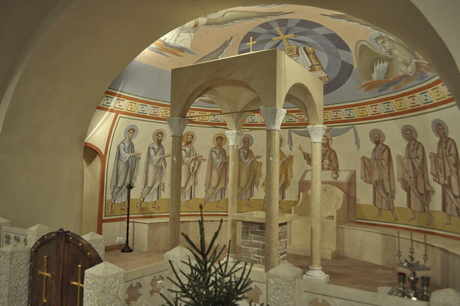
The membrane technique being used by Archimandrite Zenon. The monochrome underpainted figures on the right, and the more developed figures in various states of completion on the left. Feodorovsky Cathedral, Petersburg, 2013.
I have often heard it asserted that the only correct and traditional way to paint icons is with the proplasmos technique since one is following the Genesis account of creation, which passes from darkness and chaos towards light. While a particular technique can be used to illustrate a theological point, it is dangerous to create a parallelism to justify one technique to the exclusion of others. One can read anything into anything. The membrane technique could, for example be equally asserted as the only correct method by saying that, like the Biblical account, it fashions the body first (the monochrome underpainting of form) and then breathes into it the breath of life (colour and light). A bit of common sense is needed. It is the end result that matters, not spurious use of theology that stops one studying the wide range of techniques used in the icon’s history – and perhaps also new ones in the future.
Good figurative proportion
Even though icons are slightly abstract – for example they might elongate certain features, or even the whole figure – they nevertheless must preserve basic principles of proportion. Abstraction and distortion are very different things.
There is great variety in figurative proportion between different schools of iconography, ranging from four heads high in Coptic icons, through the more usual seven to eight heads high and up to almost eleven heads high in the case of icons by Dionysius of Moscow.
But to do this well, one needs to know what one is changing. One needs to abstract from a place of knowledge of proportion and form and not from ignorance. I therefore encourage my students to study icon models, such as Father Zenon’s, that use the more average proportions of around seven-and-a-half heads high. Once these proportions are well understood, then they are free to branch out, but with an understanding of what they are doing.
An inner and outer likeness
It is interesting, and perplexing to some, that most contemporary Byzantine descriptions of icons praise their lifelikeness. This seems to fly in the face of many recent writers who like to oppose the icon to naturalistic painting. Various explanations for the use of the term life-like have been proffered.
One explanation is that the conservative nature of homiletics, writing, and poetry in Byzantium required them to use literary forms of expression (called topoi) taken from classical writings. And these topoi valued art works to the extent that they were lifelike and realistic.
Other people have pointed out that we should not read back into this term our current associations of life-likeness with photographic realism. Life-likeness is more than physical recognisability, for it is also to do with the character of the person. As such, a lifelike portrait requires a considerable degree of abstraction in order to draw out the inner character. An ascetic, for example, tends to be painted with sunken cheeks, while a teacher might have a larger forehead.
It must also be kept in mind that the Greek word translated as ‘lifelike’ is more accurately translated as something like ‘living’ or ‘alive’. This explains why the passages that use this word often add that the writer almost expected the saint to step out from the icon.
Grace and stillness
What has impressed me most about the holy people whom I have met or known personally is their union of inner stillness with activity. Father Paisius of Athos, for example, in the daytime met with a constant stream of visitors seeking counsel, and at night prayed for many hours. And yet he struck me as someone inwardly at rest. As St Paul writes: “…I labour more than all the apostles, yet not I, but the grace of God within me” (I Corinthians 15:10).
An icon should depict this union of stillness and vigour. It should not be stilted or stiff, but nor should it show agitation. So there is usually a strong vertical axis, a lack of disturbing gestures, and a certain balance left to right. On the other hand, there are asymmetries and movement: heads rarely face us directly but are slightly turned; a standing figure shifts its weight slightly; drapery moves in rhythms.
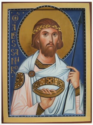
St Alexander, by Ivan Polverani, Italy. This work shows the classical balance of movement (the slight turning of the head, rhythmic drapery, asymmetrical pose) and stillness (absence of exaggerated expression and gesture, harmonious colours, balance – the lance offsetting the lettering for example.)
4. CONCLUSION
Some iconographers manage to organise their own training, the highly gifted. But this is the exception. We need to have schools and apprenticeships to teach skills and theology, establish the parameters, set standards. By standards I do not mean the partisan promotion of one particular style, but standards of artistic excellence and theological guidelines that inspire variation as well as preclude error.
And this knowledge is important not just for the makers of icons, but also for those who commission them: bishops, priests and architects. It is no good training good iconographers if those commissioning them demand sentimental icons, or cannot tell the difference between inept and skilled work.
Apart from their function in worship, icons are proving to be a profound means of mission in our world. This presents a yet more pressing need for the highest standards in our icons, wall paintings, mosaics, and all the other forms of iconography. We do not want to become precious about our icons, art critics rather than prayers and venerators. But, like a good sermon or devout and skilful chanting, we do want icons that inspire us rather than irritate us.
———————————————————————-
17] Ibid., p.51.
[18] St. John of Shanghai and San Francisco, “Discourse in Iconography” in Orthodox Life, Vol. 30, No. 1 (Jan-Feb 1980), pp. 42-45.
Quoted in http://archangelsbooks.com/articles/iconography/DiscourseIcon.asp, (accessed 7 February, 2016).
[19] https://biblethingsinbibleways.wordpress.com/2013/07/14/paul-and-his-use-of-greek-philosophy/

Thank you Aidan Hart for these two excellent and informative articles. As a novice writer of Icons they are much appreciated to help deepen reflection and improve technique. An excellent patient teacher is also required I am blessed with a real time one and even sometimes one on the internet! Thanks to OAJ, always informative.
Thank you for this profound study from both artistic and theological point of view! I would like to suggest that you also consider historical dimensions of Russian theological thought, including various atheist and agnostic influences on Byzantine an Old Russian studies; your so interesting point on transfiguration and dematerialisation has something to do with atheist ideas of icon as something silent or death in museums (although beautiful and well decorating temples as art interesting for tourists and abroad) vs church idea of icon as something live and communicating holly message even to the extend of disturbing your prayers (as in some other religious traditions); I also hope that works of prof. Mitrovich come out in English (besides the so interesting and substancial dialogue that you have started in the interview); his manual is precisely focused on the topic of teaching (and it is not as polemical as his thesis, as his works, and as most of works on iconography); it is good work to refer to, because there are a lot of distinguished theoretical and practical decisions based on iconographic part of church tradition, which is not supposed to be read, but perceived directly and only recently it can be accessed in its real scale and without cultural borders and heritage controversies