
Similar Posts
Iconographic illustration in pen and ink by Scott Patrick O’Rourke
It is my particular pleasure to introduce the Orthodox Illustration Project – an initiative under the aegis of the Orthodox Arts Journal.
In brief, the purpose of the project is to make available online a collection of graphic illustrations of the highest quality. The collection will focus on iconographic drawings and related graphic ornaments stylistically suited to the illumination of printed Orthodox publications. The project will address the needs of Orthodox book designers, graphic artists, and many others, who desire excellent imagery for their publications.
Currently, there is very little available in the way of ‘clip art’ that is well suited to Orthodox publications. The Orthodox Illustration Project will meet this need, but it is to be more than just a static database of clip-art. It is an open-ended call for artistic contributions to build up a library of imagery, and in the process, to develop a new and fresh, yet wholly traditional, style of graphic art for the service of the church.
The seeds of the project were sown in 2009 when I was asked to draw ornamental capitals and other graphics for a new translation of the Psalter. Then, in 2012, I worked extensively with Scott Patrick O’Rourke to develop a set of iconographic pen-and-ink drawings for liturgical book illustration. And Christabel Anderson contributed several excellent calligraphic drawings. We also devoted countless hours to scanning and editing ornaments from medieval Russian books and other antique sources. We now have a significant collection of images that are properly formatted for contemporary publishing – about 150 graphics so far.
Although the project focuses on the beautification of liturgical books, we envision that these graphics will useful for many other purposes. They will be suitable as cover art or didactic illustrations for various types of Orthodox books. They will lend a liturgical dignity to the pamphlets and brochures that publicize church projects and charitable organizations. They will be accessible to parish offices for use in bulletins and church school materials. And they will be useful to web designers for dignifying the Orthodox presence online. Our graphics also happen to be perfect for coloring books, which is an important means of exposing children to the beauty of Orthodox art.
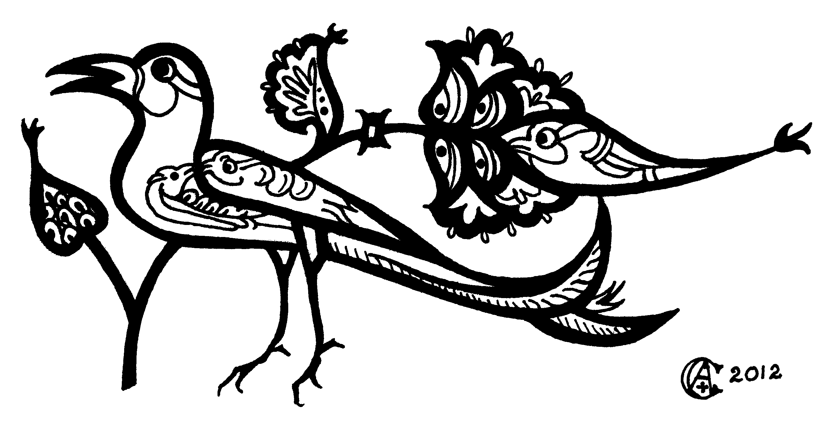
Ornament derived from the Gladzor Gospel, drawn in ink by Christabel Anderson
Call for Artistic Contributions
We would like to build upon our collection by offering an open invitation for artists to contribute. Are you an iconographer who has worked, or would like to work, in monochrome ink-drawing technique? Or an illustrator who has drawn graphic art suitable for Orthodox publications? Are you a calligrapher who could offer decorative capitals or marginal ornaments in a Byzantine, Slavic, or early-Romanesque style?
Since our focus and inspiration has been liturgical books, most of our graphics are monochrome icon drawings and ornaments. Nevertheless, we are very open to expanding our scope for the project. For instance, ink drawings pertaining to Orthodox culture, like images of Russian villages, Greek dancers, or church buildings, can be very appropriate for beautifying parish bulletins and other materials. In some cases, artwork in full color may be suitable also. For maximum flexibility, consider submitting any given illustration in multiple versions – colored, uncolored, with and without a decorative border, etc.
Most importantly, we are looking for work that is very high quality and conformant with Orthodox tradition. We reserve the right to reject any submissions that seem otherwise. This does not necessarily mean that only accomplished masters need apply. Pen-and-ink graphics can be relatively easy to draw well, and mistakes are easily corrected in Photoshop. So we would encourage any artist who finds an interest in this project to try drawing something. If an icon is beyond your expertise, consider simple ornaments – crosses, peacocks, church domes.
We are also in need of help editing drawings which need some work. This requires skill with Photoshop and an artistic eye.
All contributions must be free of copyright or authorized by the owner for unlimited distribution and reproduction. Please contact Andrew Gould if you are interested in contributing or otherwise helping with the project.
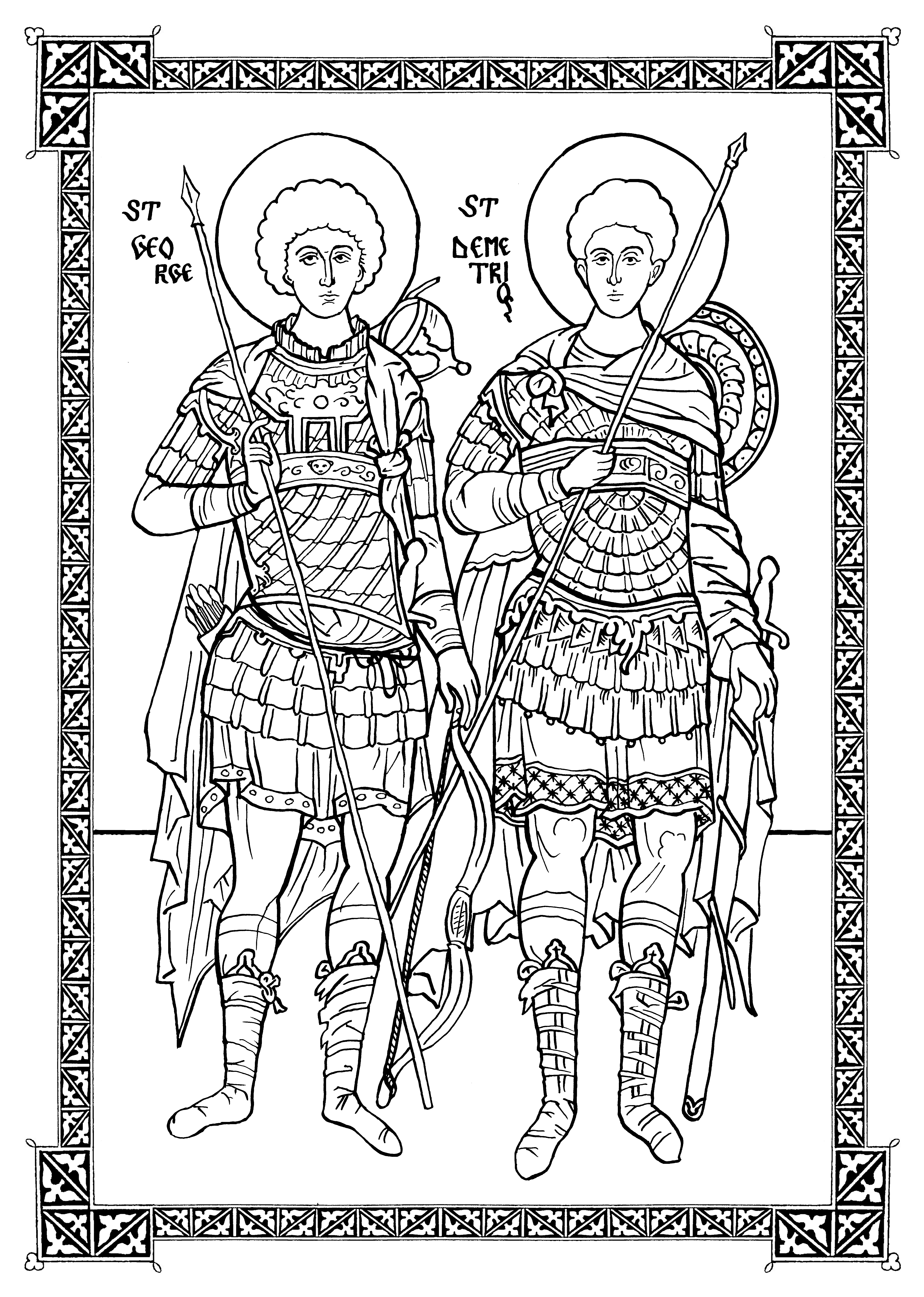
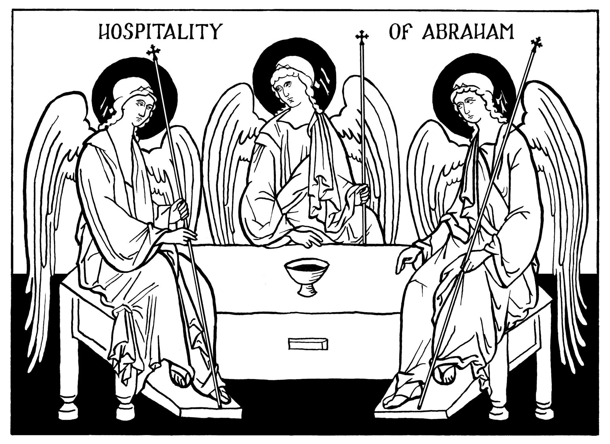
Sts. George and Demetrios, pen and ink by Scott Patrick O’Rourke
Historic Precedents and Artistic Considerations
We begin with this question: What is the ideal form and style of graphic illustration for Orthodox publications?
Since liturgical art is the highest vocation of an Orthodox artist, and also the inspiration for any truly-Orthodox para-liturgical arts, we must begin with an honest look at liturgical books. We could easily say that our answer lies in the most splendid illuminated manuscripts of the middle ages – text hand-written on vellum with gilded capitals, copiously illustrated with jewel-toned miniatures painted in tempera. But these cannot serve as our model for modern printed books. Photographic reproductions of painted icons on shiny paper are cold and lifeless compared to hand-painted miniatures. And they do not sit comfortably alongside the perfectly uniform fonts of modern printing. It is not practical for modern book designers to seamlessly integrate icons, ornaments, decorative capitals, and paragraphs of text. And if they try to do so, the effect seems too complicated, too pretentious, for the ordinary materials of modern paper and ink do warrant such elaboration. Without raised gesso and gilding, without the crinkle of handmade paper, modern books are doomed to a certain utilitarian simplicity, and their design must accept this, and not deny it, if they are to have dignity.
So it is quite appropriate that contemporary liturgical books are generally printed in just one or two colors (black and red is ideal), and that they use uniform digitized fonts. Fortunately, history is not devoid of venerable examples of simple printed liturgical books. Rather, they have been normative in the church for five-hundred years. At first, they were printed with moveable type and illustrated with wood-block prints. An examination of these early printed books shows that a very successful style of illustration for them developed quickly. Most importantly, the general scale and texture of the carved wood-block icons and ornaments was quite similar to that of the lettering. Thus the graphics and the letters seem to belong together on the page – they integrate into a whole that is more than the sum of the parts.
These early printed books serve as the inspiration for most of our designs. The simple line-drawn icons bounded in a frame, the occasional ornamental header and decorative capital at the beginning of a chapter, the use of black and red – we find these an ideal solution for the aesthetic of modern typography and printing.
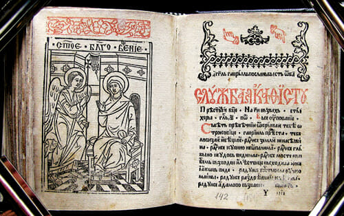
A horologion printed in 1566
Commentary of St. John Chrysostom on the Letters of Paul, printed in 1623
Technical Requirements for Contributions
Resolution should be at least 300dpi at the actual size that the graphic would be reproduced. So if you draw something tiny and imagine it will be printed larger, scan at higher than 300dpi. If you draw something very large, and shrink it down, scan at lower than 300dpi.
For ink drawings, we have found the following process works well. Compose an initial sketch in pencil. Then lay tracing vellum overtop, and ink the drawing using rollerball pens or calligraphy nibs with liquid ink. Scan the ink drawing, then increase brightness and contrast in Photoshop until all pixels are either black or white (no gray pixels). Then it is very easy to edit mistakes in the digital image. Finally, save as .gif. If necessary, we can help with scanning artwork and formatting files on our end.
We are also interested in graphics derived directly from medieval book ornaments, or from older printed books that are out of copyright. These can be scanned from books and manipulated in Photoshop as described above to achieve true monochrome, and to correct any damage and warping in the original image.
As the collection grows, we will work to develop an interface for the database on the Orthodox Arts Journal website. We would welcome a volunteer with appropriate expertise to help with this.
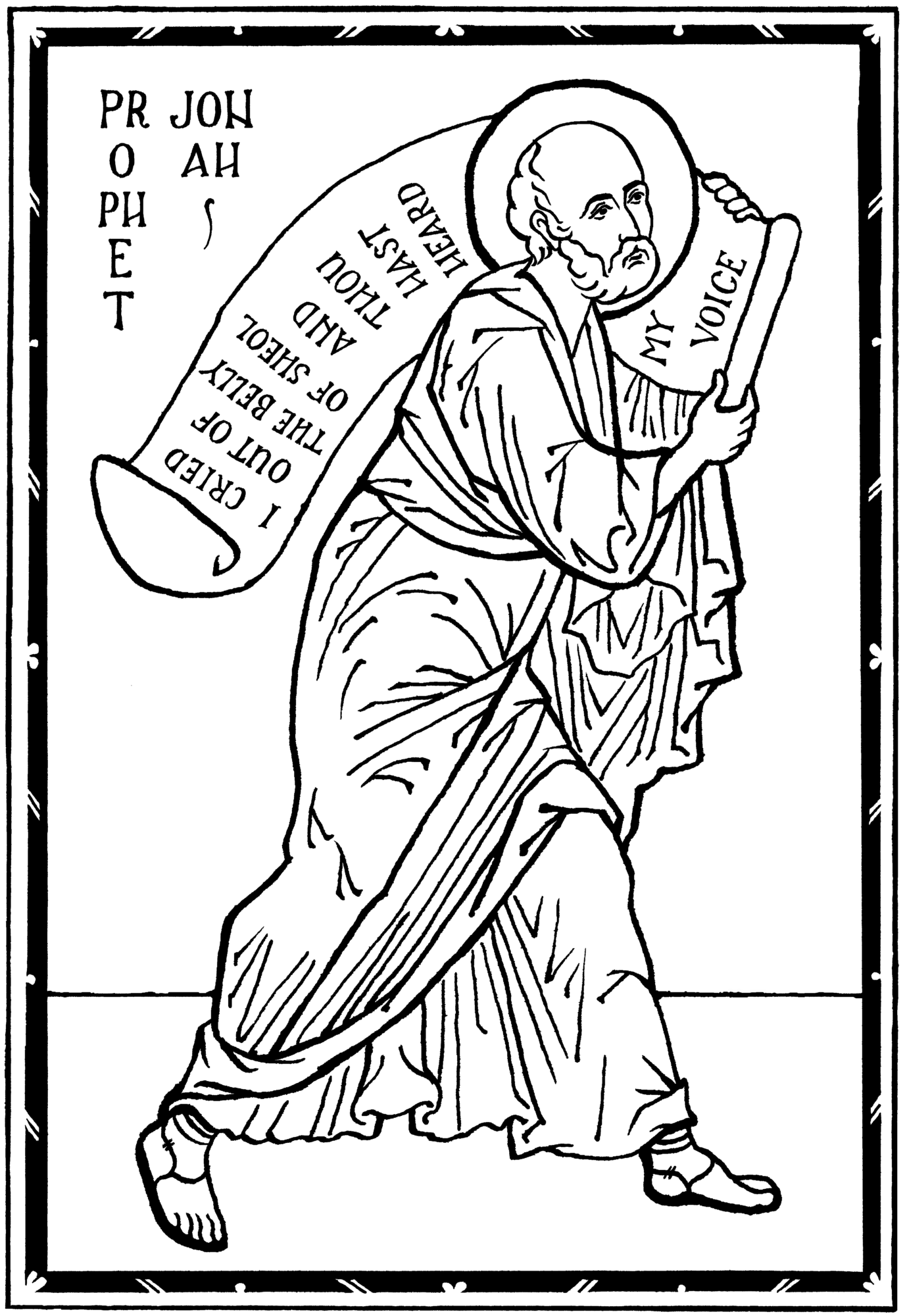
Prophet Jonah, pen and ink, by Scott Patrick O’Rourke
Availability and Licensing
Updated 2017 – The Illustration Project Graphics are now available for easy download through the Orthodox Arts Journal website. Scroll down on the homepage to find the link, or access it here. The graphics are organized into categories, and most of them are available in both raster and vector format.
Images are available free of charge for use in non-commercial publications such as parish bulletins, parish websites, church school materials, etc. For commercial and professional uses, such as published books that are printed for sale, and commercial websites, we will ask for a voluntary donation to the Orthodox Arts Journal. We will also request that credit be given to the OAJ and to the author of the image where appropriate. No users will be granted exclusive rights to use any image.
Ornament digitally adapted from an old Russian manuscript

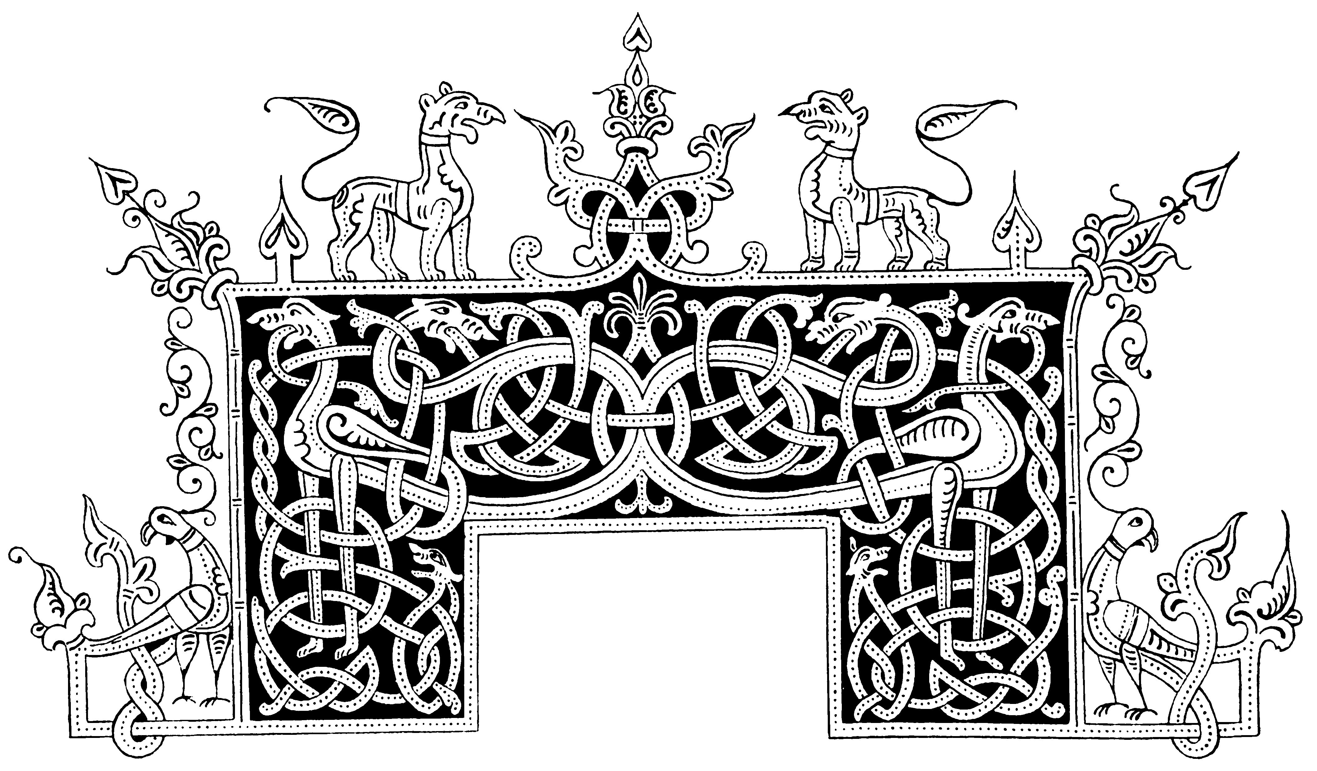
Full-page ornament drawn in pen and ink by Andrew Gould
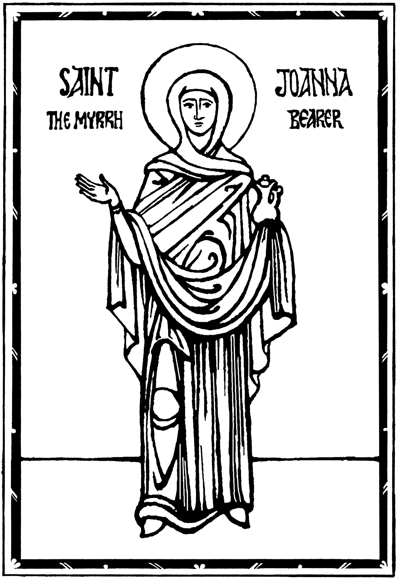
St. Joanna, originally drawn in sepia and quill pen on vellum by Christabel Anderson, digitally adapted to a monochrome graphic.
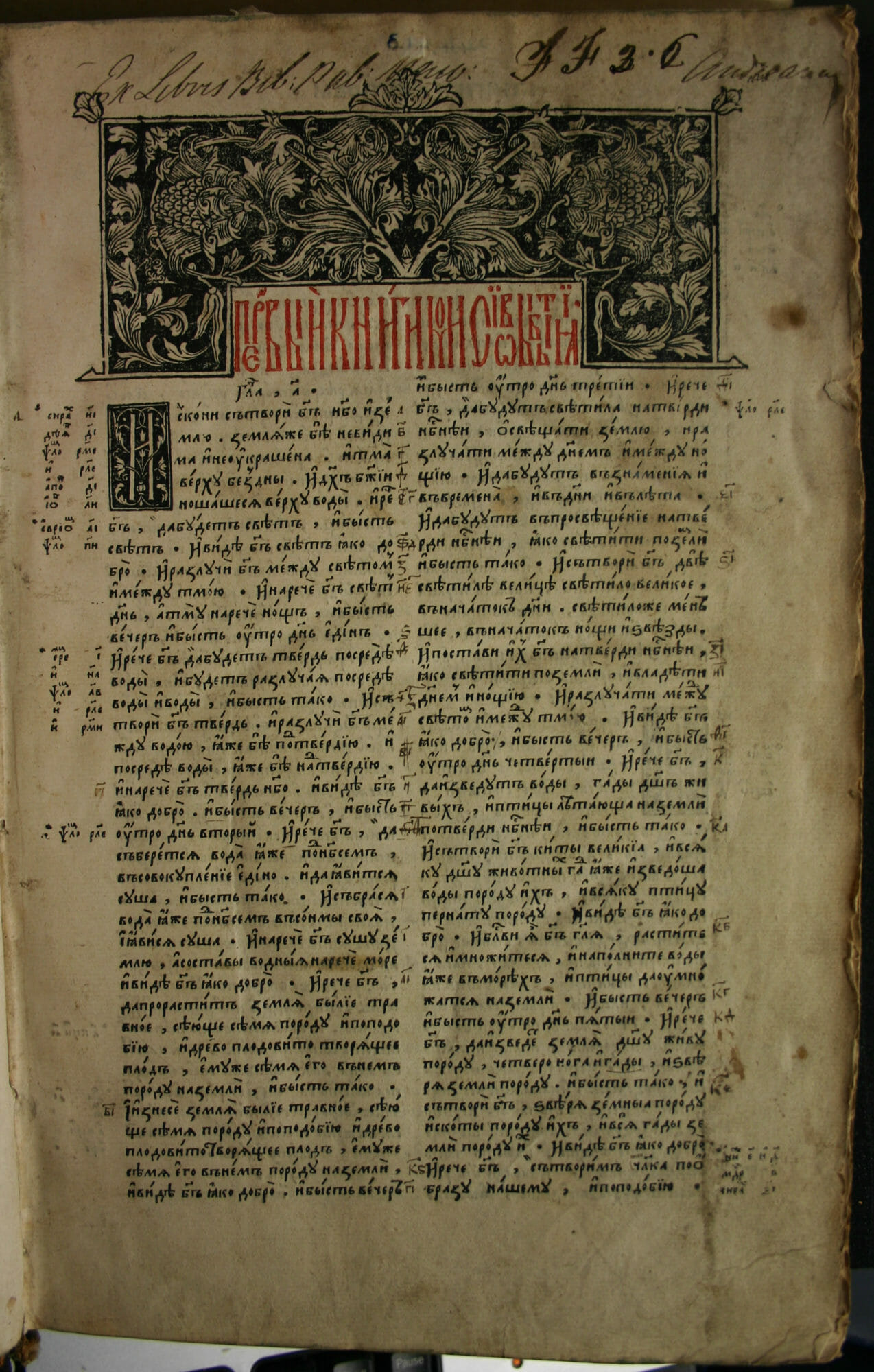
The Ostrog Bible, first printed Slavonic bible, 1581.
Ornament digitally adapted from a Greek book printed in Venice in 1499
Ornament digitally adapted from an old Russian manuscript
Wood-block print made from a 17th-century printing block discovered at Hilandar Monastery

Crucifixion, pen and ink, by Scott Patrick O’Rourke
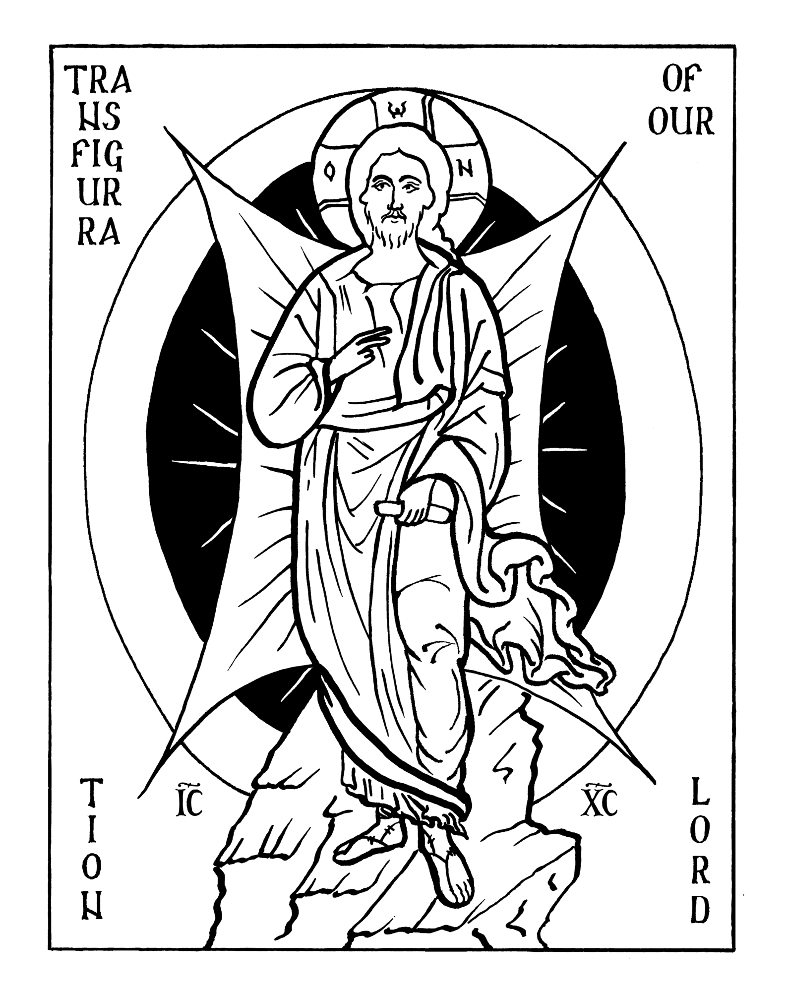
Transfiguration, pen and ink, by Scott Patrick O’Rourke
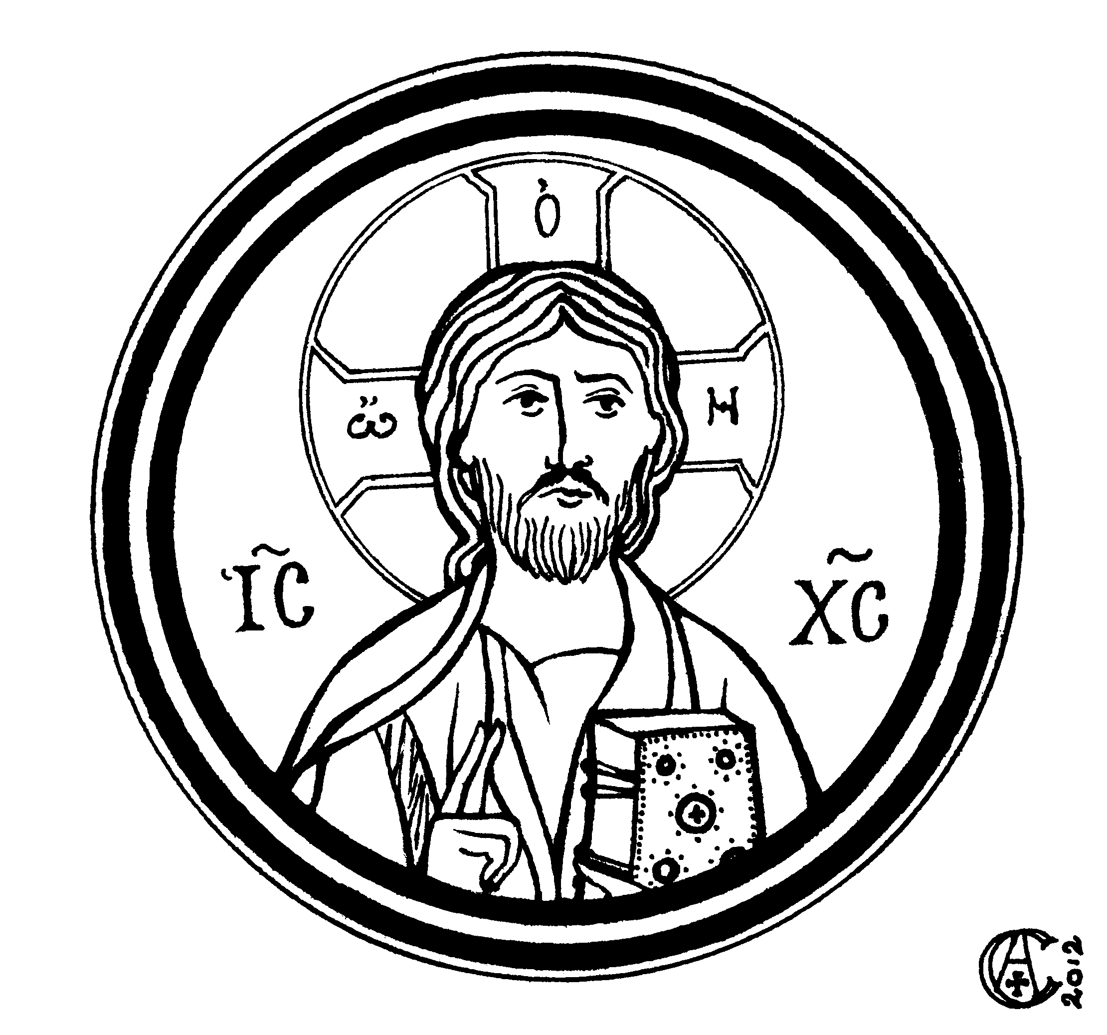
Iconographic rondel, pen and ink, by Christabel Anderson
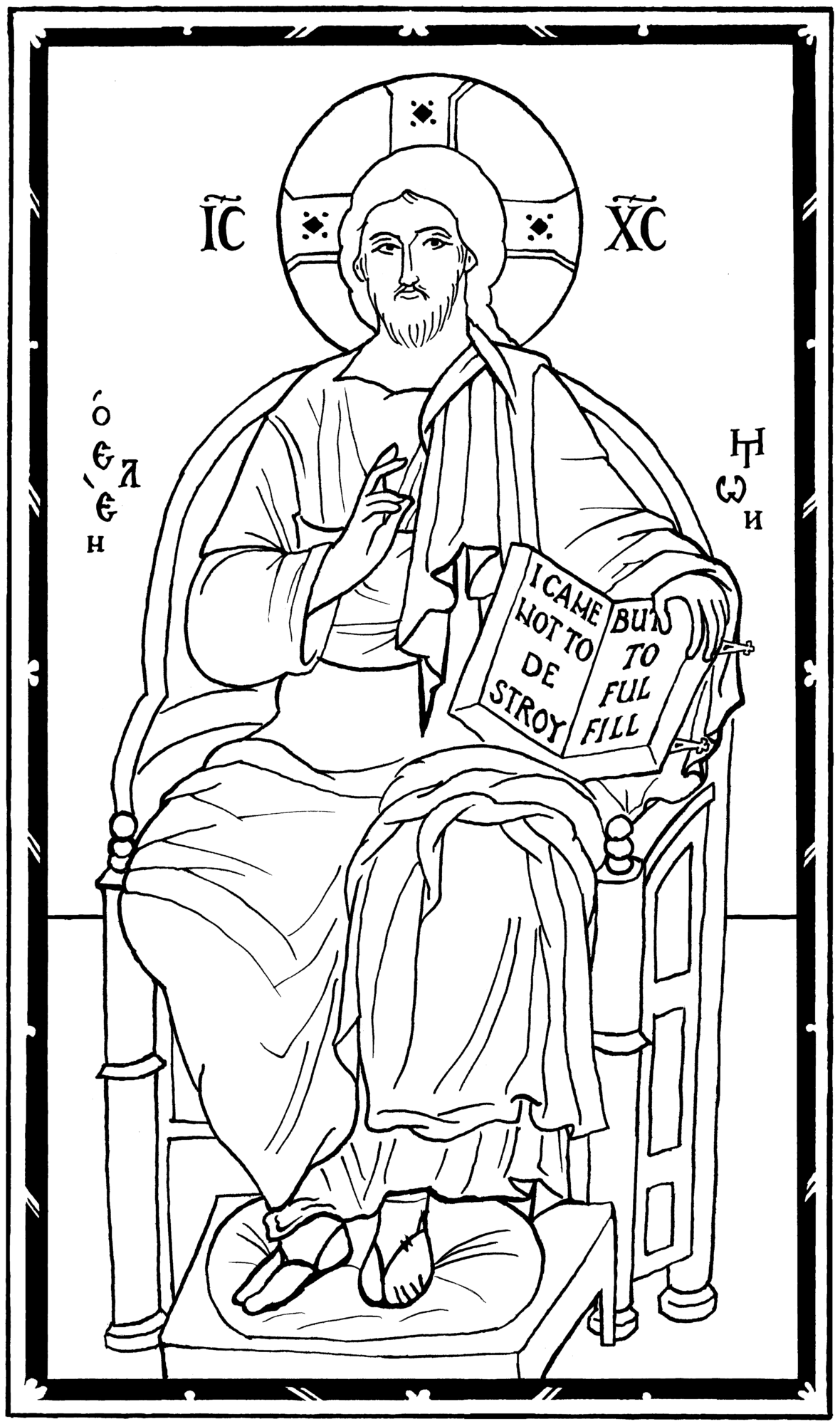
Christ Enthroned, pen and ink, by Scott Patrick O’Rourke
Ornament digitally adapted from an old Russian manuscript

Ornament digitally adapted from an old Russian manuscript
Ornament digitally adapted from an old Russian manuscript
Ornament digitally adapted from an old Russian manuscript
Ornament digitally adapted from an old Russian manuscript
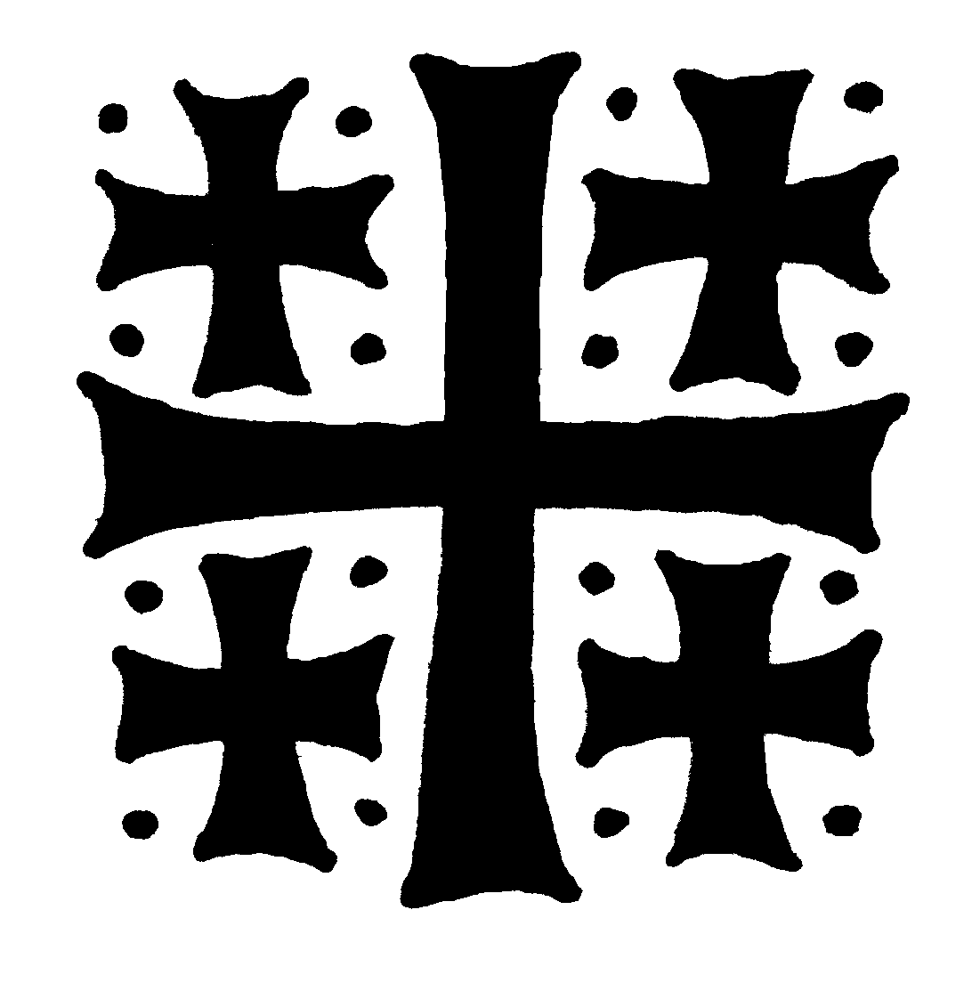
Jerusalem Cross, pen and ink, by Andrew Gould
Icon-not-made-by-hands, pen and ink, by Scott Patrick O’Rourke
Entombment of Christ, pen and ink, by Scott Patrick O’Rourke
Three Holy Hierarchs, pen and ink, by Scott Patrick O’Rourke
Tree of Life Cross, pen and ink, by Scott Patrick O’Rourke
What a wonderful idea!! I look forward to this to use for my three children during liturgy or church school. I am also a novice wood carver. Would this be available to use for wood carving, itilizing the images as templates? Thanks a ton for your work
Certainly. In fact, one of the oldest uses of printed iconographic drawings was as templates for iconographers. So it makes perfect sense to use these for wood carving.
I would be delighted to offer some calligraphy as needed for these worthy projects. You may contact me through my website http://www.calligraphybycarla.com and see some examples of my work, though I am able to do many other calligraphic styles than just what you see on the website. I have been a professional calligrapher for 30 years.
As the producer of a Church bulletin (and dabbler in other Church media) I am VERY pleased to see this and look forward to it eagerly! Thank you for doing it!
Awesome project. I can imagine these being useful for educational use as well, when the goal is to illustrate the iconography over the individual icons. My university prints textbooks in black-and-white on rough paper, which for art history mostly results in either no pictures at all, or bad photocopies. Never understood why they never tried old woodcuts of paintings, at the very least.
Will you use a specific license, such as Creative Commons BY-NC (Attribution, Non-Commercial)? Might save you the trouble of writing long licensing terms, and that would still allow a looser license on individual basis. Be sure to think of adding field for the license in the database you’re constructing. A direct scan from a book in the public domain would be public domain as well, for example.
The idea is interesting and perhaps useful. I want to add that there is no orthodox tradition in graphics. There is a russian tradition in graphics, which probably started in the 16th century, a 100 years after the fall of Constantinople. Authentic orthodox painting not uses graphics because the colors are essential in the language of orthodox iconography. Many manuscripts used color even for letters. Some has been written even with gold ink. Not to mention that the first letter of the first passage in a particular text is interlaced with the whole paintings and this letter is called interstitial.
I can say this because I well know orthodox heritage in iconography. Between 5th and 15th century there is not even a single manuscript, illustrated with graphics – neither in Byzantium, nor in Italy, nor in Bulgaria, nor in Serbia, nor in Macedonia, nor in Egypt, nor in Syria, nor in Georgia, nor in Armenia, nor in Russia, and etc. Nowhere! Graphics just has been not in orthodox tradition. There is a russian tradition in this respect – from 16th century. But she is only a russian tradition, not orthodox, because it was occupied by non-orthodox culture.
Whether the graphics is an orthodox image? I’m convinced it is not. In the name of propriety your enterprise should recognize that is connected with russian tradition, not with the orthodox tradition.
I must respectfully disagree with your comment. Certainly, it is true that block-printed icons as book illustrations are more typical of Russia than elsewhere. But one can hardly say that the entire genre of graphic (ie: monochrome line art) is absent from Orthodox tradition otherwise. From very early on in Byzantine art, line drawings were sometimes used as a substitute for full-color painting. For instance, antimensia were always adorned with simple line drawings drawn by the bishop in pen and ink. Ancient ones survive on Mt. Athos. In more recent centuries, antimens were printed with engraved copper plates, often bearing elaborate monochrome icons. There are some beautiful Serbian and Romanian ones from the 18th century in museums. Also, there are churches in Cappadocia frescoed completely in primitive line art, because the church could not afford a professional painter. Another excellent example is icons and ornaments engraved onto sacred vessels. These are clearly line art, and closely allied to intaglio printing plates. And they can be found in the metalwork of all countries going back right to the beginning of Orthodoxy. With regards to liturgical books, long before books were printed, plenty of books were hand-illuminated with ornamentation in just black or just black and red. These medieval manuscripts look very similar to early printed books – sometimes hard to tell apart in a photograph. So the graphic aesthetic I’m promoting here is by no means limited to printed Russian books. Even icons were sometimes drawn quite graphically in medieval manuscripts. Of course, the finest manuscripts were illuminated in full color, but simpler ones often had icons just drawn with a pen and slightly colored with a wash. This should hardly be surprising, considering that all icon painters begin with a drawing, and that these preparatory drawings are often extremely attractive in their own right. I think we could call preparatory drawings in and of themselves an ancient Byzantine tradition of graphic art.
Of course there is the classic Orthodox Clip Art which is no longer printed, but is available in digital format here http://dce.oca.org/resources/line-drawings/. However, I know the author will be very happy to see a new generation.
Yes, Fr. John’s work will always be useful, too! Thank you.
These are wonderful! Thank you for creating these. Since I am a graphic designer and Sunday School teacher I have done some similar things and now you are making it easier. I will share this link with our teachers.
This is an excellent idea. However, I would ask that you consider offering some guidelines for those who download and use this illustrations for their children to colour. These images are generally sacred and will need to be treated with due reverence. How should people dispose of them when they are done, since they are icons of a sort? I am sure that the last thing you want is to have a plethora of printouts of the images lying around, stepped on, or worse… Some guidance in how to treat the images once they are printed out, would be good.
Fr. Richard, you raise a very interesting question. It seems to me that not all reproductions of icons are necessarily also icons (in the liturgical sense). If we glue them to a board and venerate them, then we should follow through and treat them as icons in all ways. But how should we treat pictures of icons that are just illustrations – pictures in art books, marginalia in parish bulletins, church school materials, etc.? Personally, it strikes me as unreasonable to say that every such image must be treated as a liturgically sacred object. But I also certainly wouldn’t want to seem them crumpled up and stepped on, either! There must be some appropriate middle ground. I’m curious if any of our readers have given careful thought to this question, and would care to share some wisdom.
You are right, Andrew. Printouts of icons are not the same a liturgical icons, but neither are they NOT icons at all. I don’t have an easy answer either. Certainly printouts should not be crumpled up and thrown away, nor left on the floor. Ideally, they should be hung up out of harm’s way. However, should they be recycled, or burned when it comes time to dispose of them? I would be interested in other comments and wisdom too.
As an illustrator who builds church school lessons for my class (ages 3-5), I have always wondered about the use of b/w icon drawings in handouts. I occasionally leave off the title on the drawings of icons. That makes it unfinished, and I have hoped that takes away the problem.
An answer to this question is needed.
I have always adored the illustrations in my prayer books, and they are my favorite types of illustrations to make. Can’t wait to see the database.
Hi Lauren. If I understand correctly, you are concerned about whether such a drawing is really an ‘icon’, and thus whether it warrants the inscription of the name of the saint. In my opinion, this problem does not really exist in Orthodox tradition. Until quite recently, there was never any sharp distinction between ‘icons’ and everything else. The word, of course, simply means image, and was used interchangeably for all kinds of images (and still is in Greek). As for ‘holy images’ (images of saints), there was always a spectrum. At the top would be the authoritative canonical icons promoted for veneration and copying by the councils and hierarchs. These were sometimes even inscribed personally by a bishop as his sign of approval. At the bottom of the liturgical spectrum would be the image of Christ on every Byzantine coin. Anything else fell somewhere in between. Frescoes and mosaics on walls, for instance, were never meant for personal veneration, and often had wide leeway with apocryphal subject matter. They were not considered as authoritative as panel icons, but they were still blessed as liturgical art. Sometimes they bear inscriptions and sometimes they don’t.
In any case, my point is that there is not really any ‘rule’ in Orthodoxy that only painted boards constitute icons, or that only icons may have inscriptions, or that every inscription implies approval by the bishop. Ultimately, what matters is that your artwork is edifying and appropriate in its particular context. If the title-inscription is helpful to the purpose in which you are using the image, then I think it’s fine to include it.
This is wonderful. I taught Sunday School (3rd grade) for 37 years and would have loved to have coloring books containing this type of art. What an excellent (and fun) teaching tool for young children.
I’m glad to see people raising the issue of whether these should be colored on. I’m going to begin teaching at a Catholic middle school in the fall, and one thing that concerns me a little about the school is that, while it has a very, very strong sacred music program for students, there are no sacred art classes for students and I gather there’s kind of an “anti-drawing” and “anti-coloring” mindset, which I think is seen as being too “childish” for middle school students.
As a teacher I try to reward students who complete work early with things like being allowed to color, or to use art and illustrations in their analysis of literature. (I’m an English teacher.) I think the school would be more receptive to letting students do this if they could see the drawing/coloring as being related to the sacred tradition.
I think it’s a little myopic for a school to emphasize sacred music to the exclusion of sacred art since they are both, I think, equally integral to the Christian tradition. For that reason, I’d like to make use of these graphics in my class. But I hesitate to provide students with sacred images that they won’t treat with due reverence, so I wanted to know what people on this forum think if I were to use these graphics in a classroom setting like that?
Hi Seth – Thank you for your question. In my opinion, it is very good for children to draw and color icons. I have personally observed that it is an edifying act for them, bringing them closer to the saints, and developing in them a pious attraction to icons. I heartily encourage it. Of course, older children should certainly be instructed to treat these drawings reverently, and to try to copy the appropriate colors from painted icons. Once they have tried coloring them, and have become familiar with the images, they should also be encouraged to try drawing them from scratch. The results might be atrocious, but nevertheless, it’s a good way for them to adopt icons as a pious tradition that they can understand. (And by all means – show the children where their drawings need improvement, and help them to do better. Correct drawing requires close instruction, just like correct spelling.)
Icon coloring books are pretty ubiquitous in both Catholic and Orthodox churches, so I think it’s safe to say that the general opinion of the church is that it is okay for children to color icons. Remember that to an innocent child, drawing an icon is no different than drawing a picture of her family. And it should be no different. Icons are simply portraits of saints, and they are only sacred liturgical objects when we use them as such. I think it is clear from Jesus’ own words that we should never hinder children from approaching that which is sacred out of some adult fear of impropriety.
(And yes, you are right that it is very foolish for a school to teach literacy and music, but not visual arts.)