
Similar Posts
In Part 1 of this article, I gave examples of historic Orthodox woodwork decorated with polychrome, and discussed the reasons why this can be effective. Specifically, I compared the visual impact of historic painted and gilded iconostases with modern carved and varnished ones.
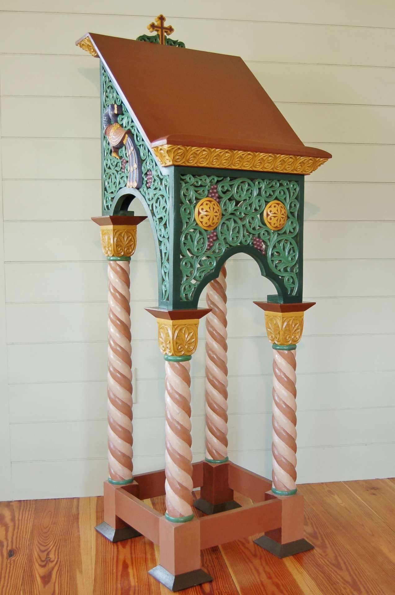
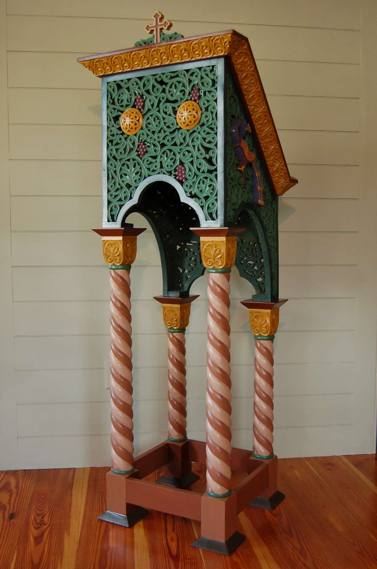
In this post I shall describe my own experience applying polychrome to a modern Neo-Byzantine analogion.
The analogion was designed and made years ago by woodcarver Mary May, a professional colleague of mine in Charleston, SC. Mary learned her trade studying Byzantine carving under Konstantinos Papadakis, and this analogion was her thesis project. It is made of basswood and was originally finished with polyurethane, which had become discolored over time. I suggested that the problem with the finish could best be addressed with a traditional polychrome paint scheme, and offered to take on the project.
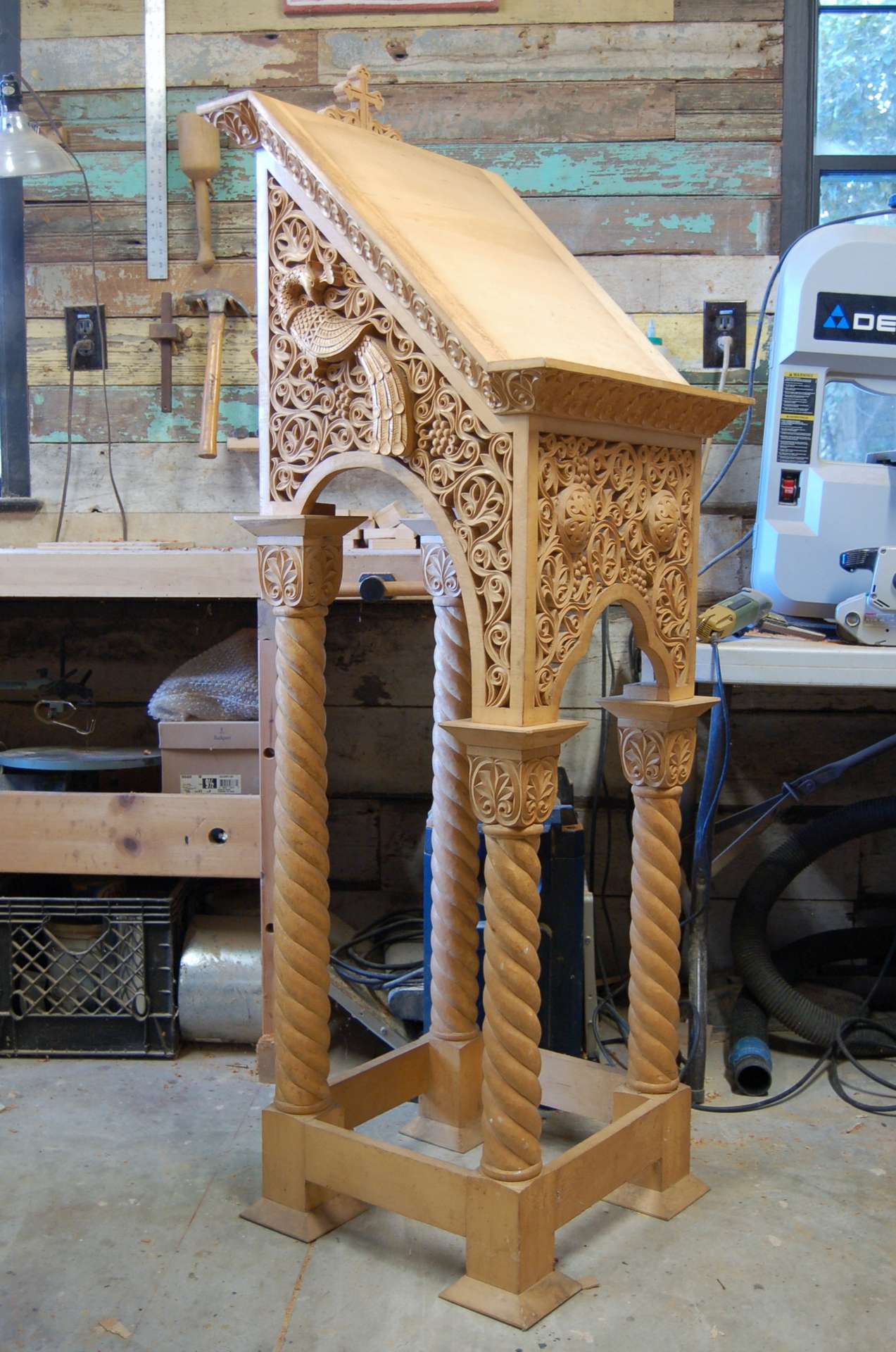
The analogion before painting
For the paint I used Ronan Japan Colors, a very high-quality dead-flat oil-based paint. It has high pigment density, can be thinned indefinitely with mineral spirits, and dries quickly. It is specially formulated for decorative painting, and proved ideal for this application.
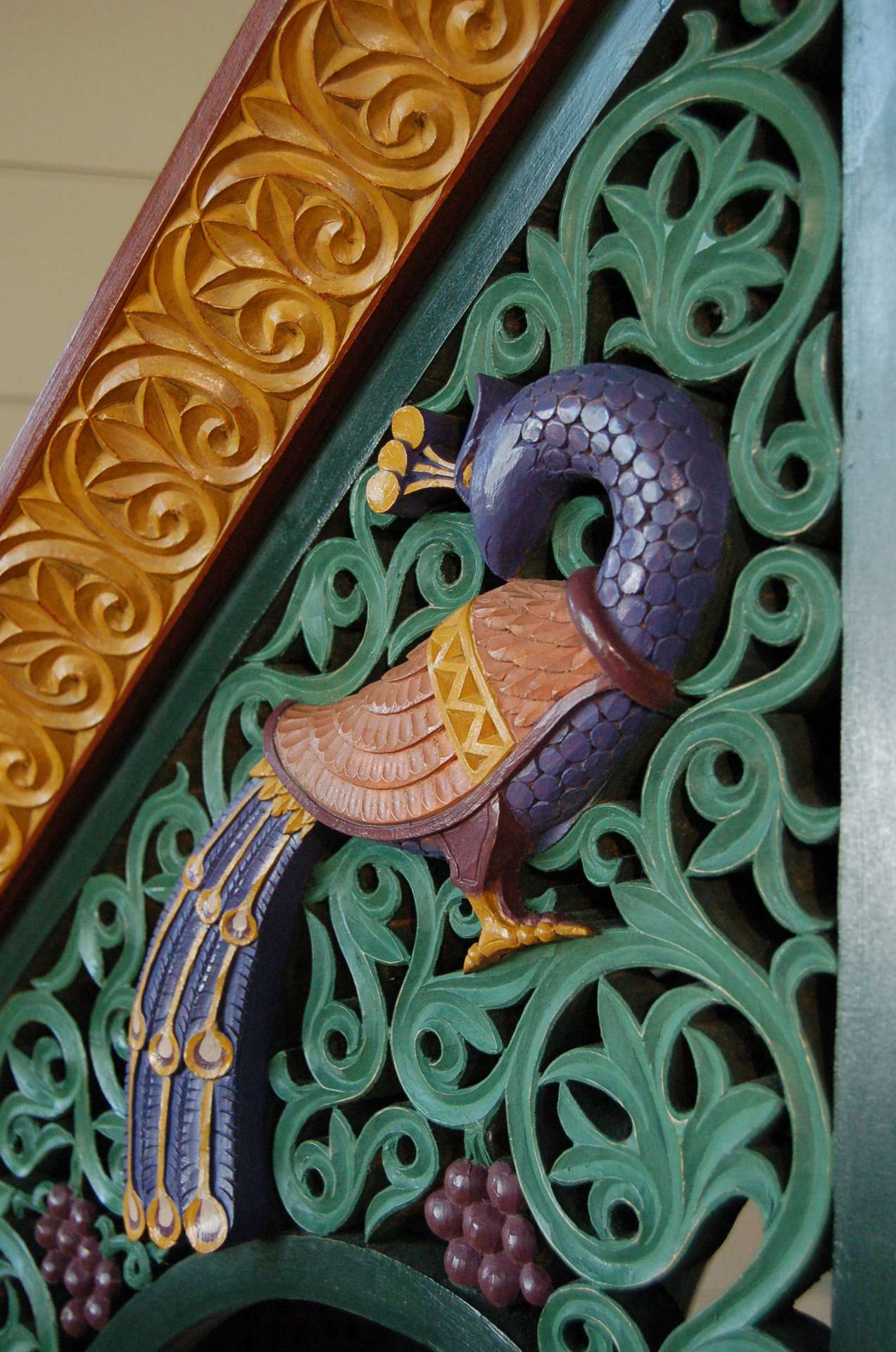
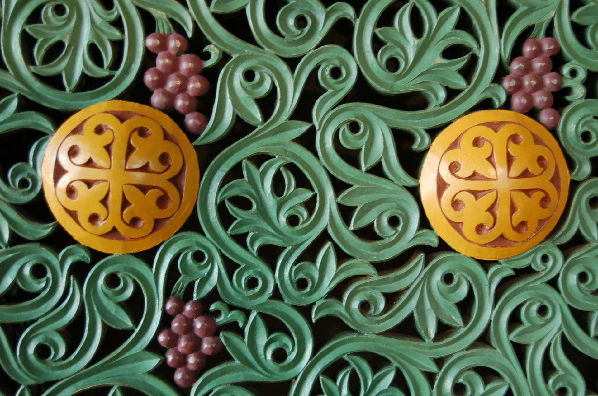
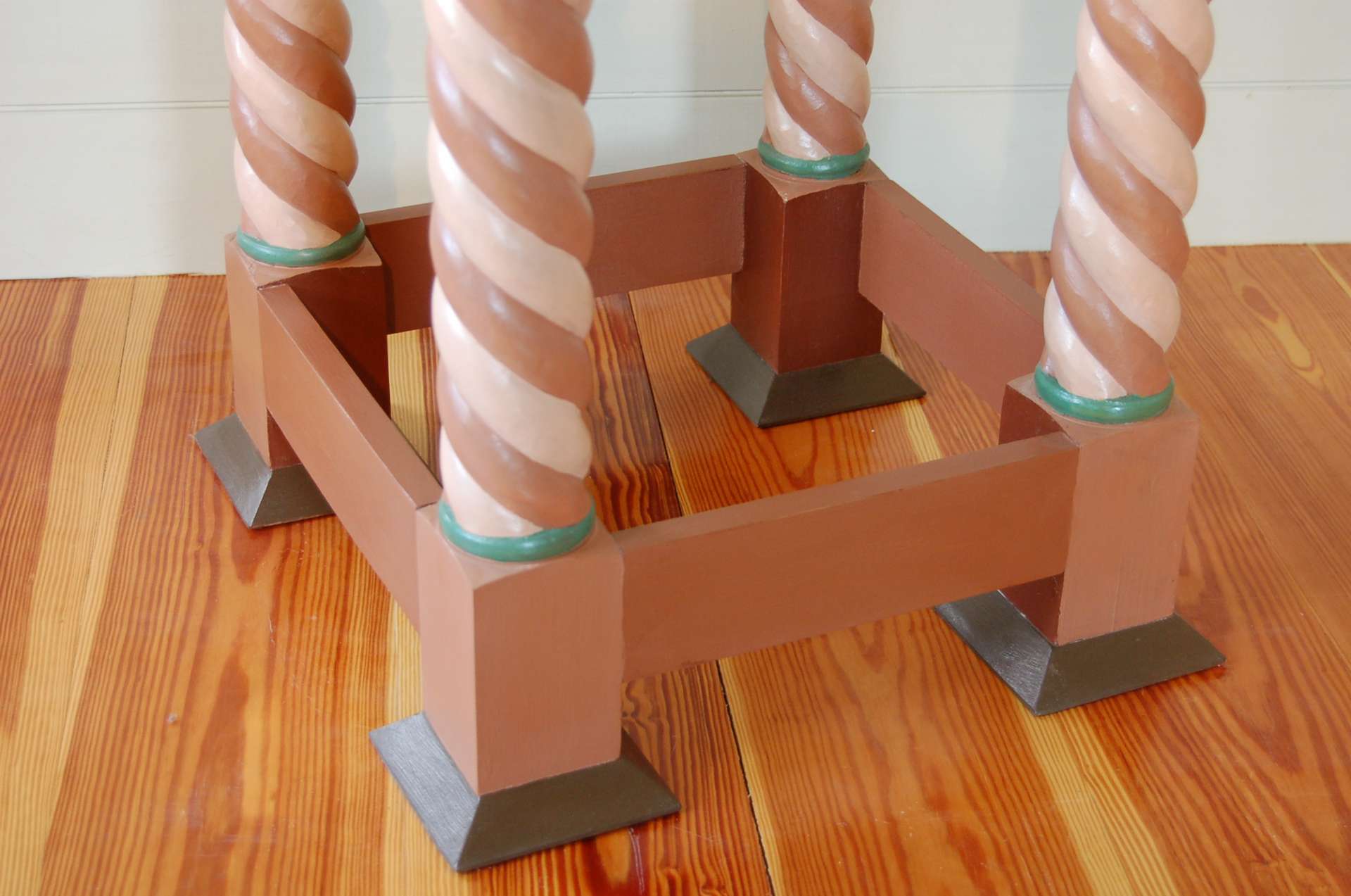
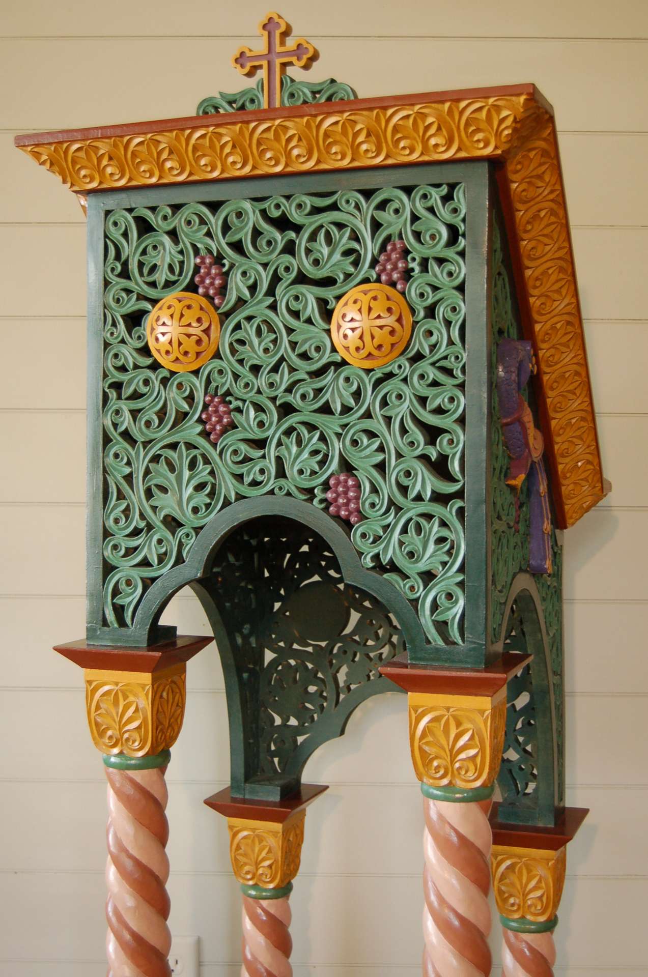
I began by using ‘Copper Phthalocyanine Green (Dark)’ to paint the interior of the analogion and all the edges of the pierced foliage carving. Painting inside the hundreds of tiny cutouts was quite time-consuming, and required use of a large pipe cleaner as the brush. I then mixed this dark green with ‘Emerald Green’ to get a lighter and brighter hue, with which I overpainted the front face of the leaves and stems. This makes the carved shapes stand out better against the dark background color.
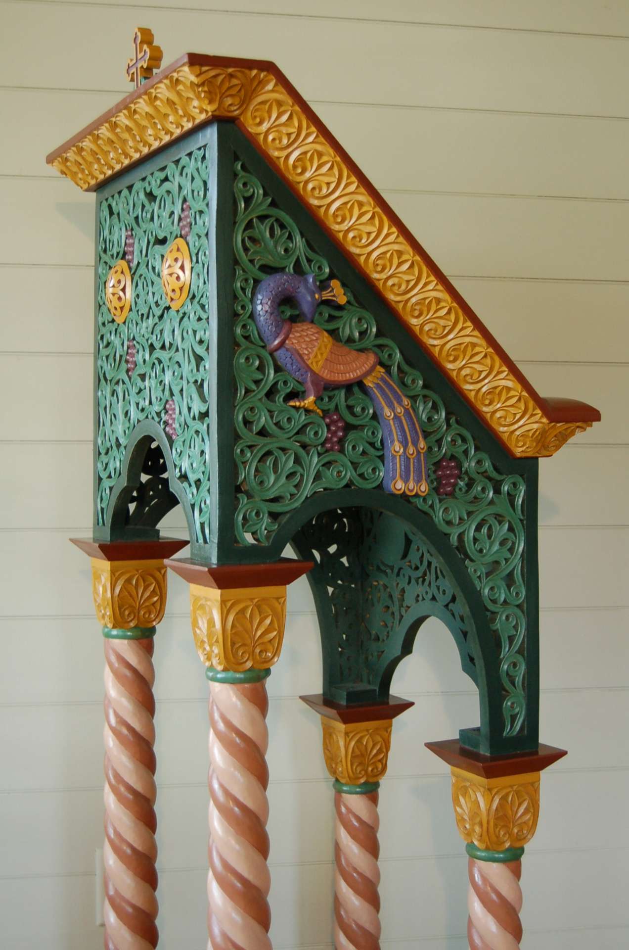
I struggled to select colors for other areas. Initially I painted the cornice and capitals red, but this appeared too dark from a distance. I repainted them in ‘French Yellow Ochre’, which gives a similar effect to gilding. I chose ‘Burnt Sienna’ as the neutral brown for the top surfaces, and mixed it with different amounts of white for the various surfaces on the columns and base. I used ‘Ultramarine Blue’ on the peacocks, mixed with ‘Poster Red’ for the purple outlines and for the grapes. Choosing the right colors for each detail took considerable experimentation, and I had portions of each part painted as many as five different sample colors before I could make a decision!
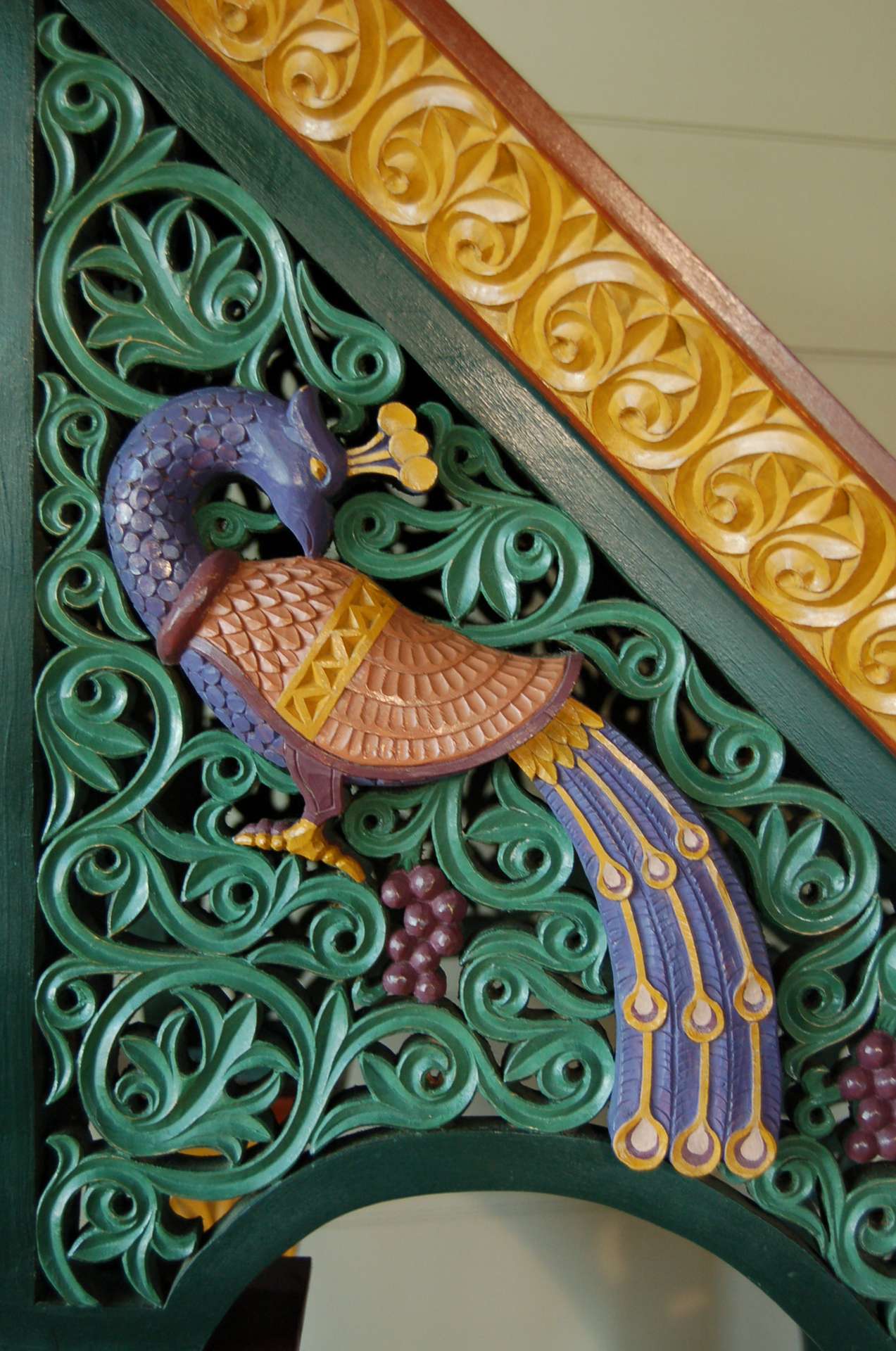
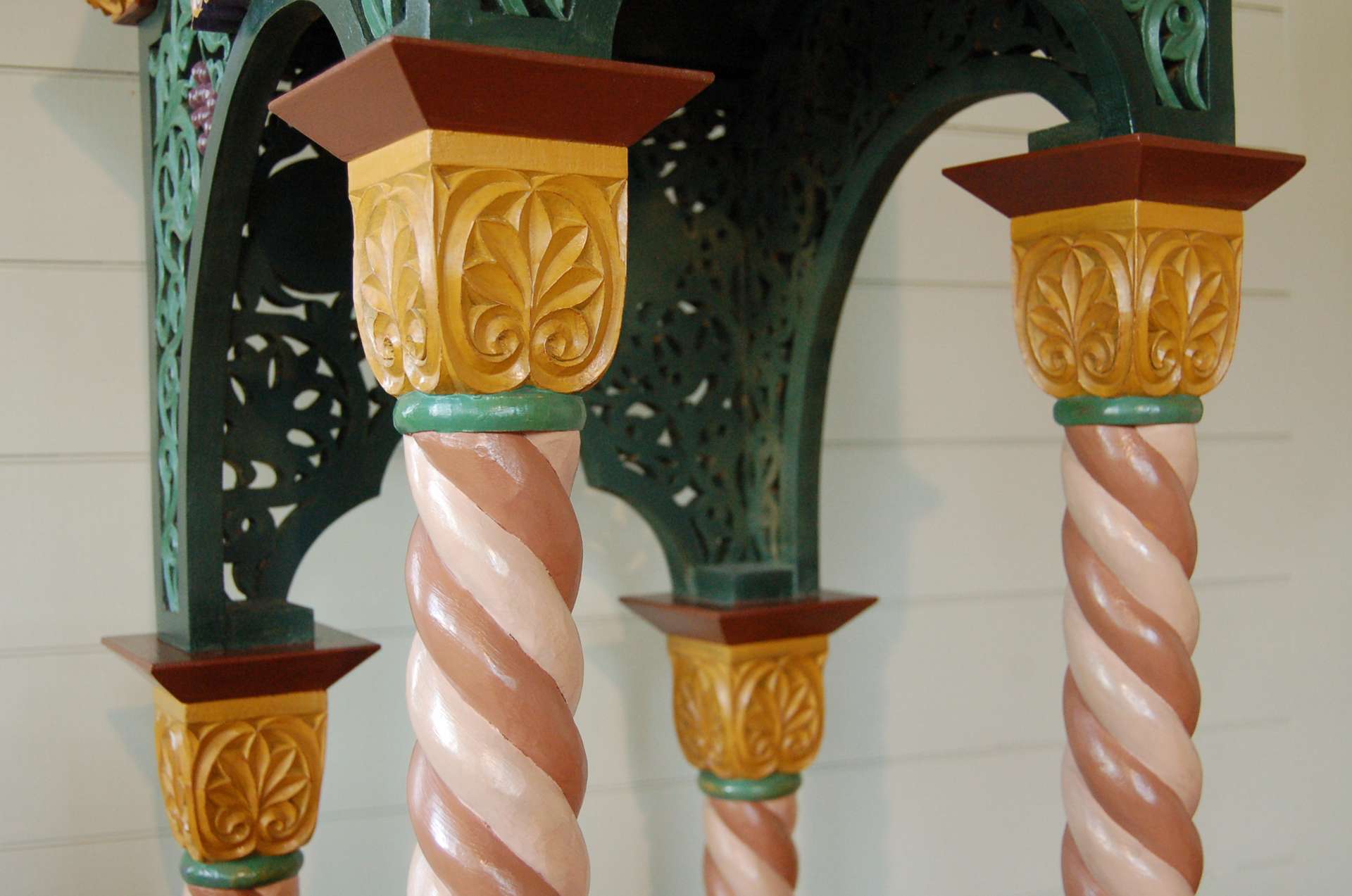
Once the painting was complete, it had a uniform dead-flat luster. In order to bring up some shine, I rubbed all the paint vigorously with a rag. This polished the raised edges and even broke through the paint at many high spots, adding some appearance of age to the patina. (It even proved fortuitous that the yellow ochre was painted over red paint, because the red shows through at the sharp edges, adding considerable richness). But the luster was still a bit duller than I wanted, so I sprayed everything with clear shellac, which saturated the matte finish of the paint and darkened the colors slightly. Finally, I rubbed everything down again with ultra-fine steel wool and applied a coat of paste wax.
This multi-step process of rubbing and polishing and waxing left an immensely rich and attractive luster to the surface of the paint. Had I used glossy paint to begin with, all the surfaces would have been uniformly shiny, and somewhat sticky and susceptible to fingerprints. But by using matte paint and building up a shellac and wax polish on top of it, only the high spots are shiny, and the low spots remain dull. This is exactly the patina that can be seen on antique painted furniture, and it makes for a surface that is inviting to touch. It is also quite effective at emphasizing the relief of the carving, especially in dim light.
The result is an analogion that makes a spectacular visual impact even from a considerable distance away. Admittedly, the color scheme is a bit intense for most Orthodox church interiors. It would fit very well in a Romanian village church, full of folk-style icons and vibrant textiles, or as an inviting centerpiece in a plain log-built chapel. But it would not belong in a strict Byzantine interior, all marble and gold. In any specific church, a polychrome scheme would need to be chosen that coordinates with the icons and other surfaces in the building. In most cases gilding would be the most effective finish (especially for an iconostasis), but I hope that this analogion project illustrates that even inexpensive painting can be highly effective at enriching liturgical woodwork.
The painted analogion is for sale. Please contact Andrew Gould if interested.

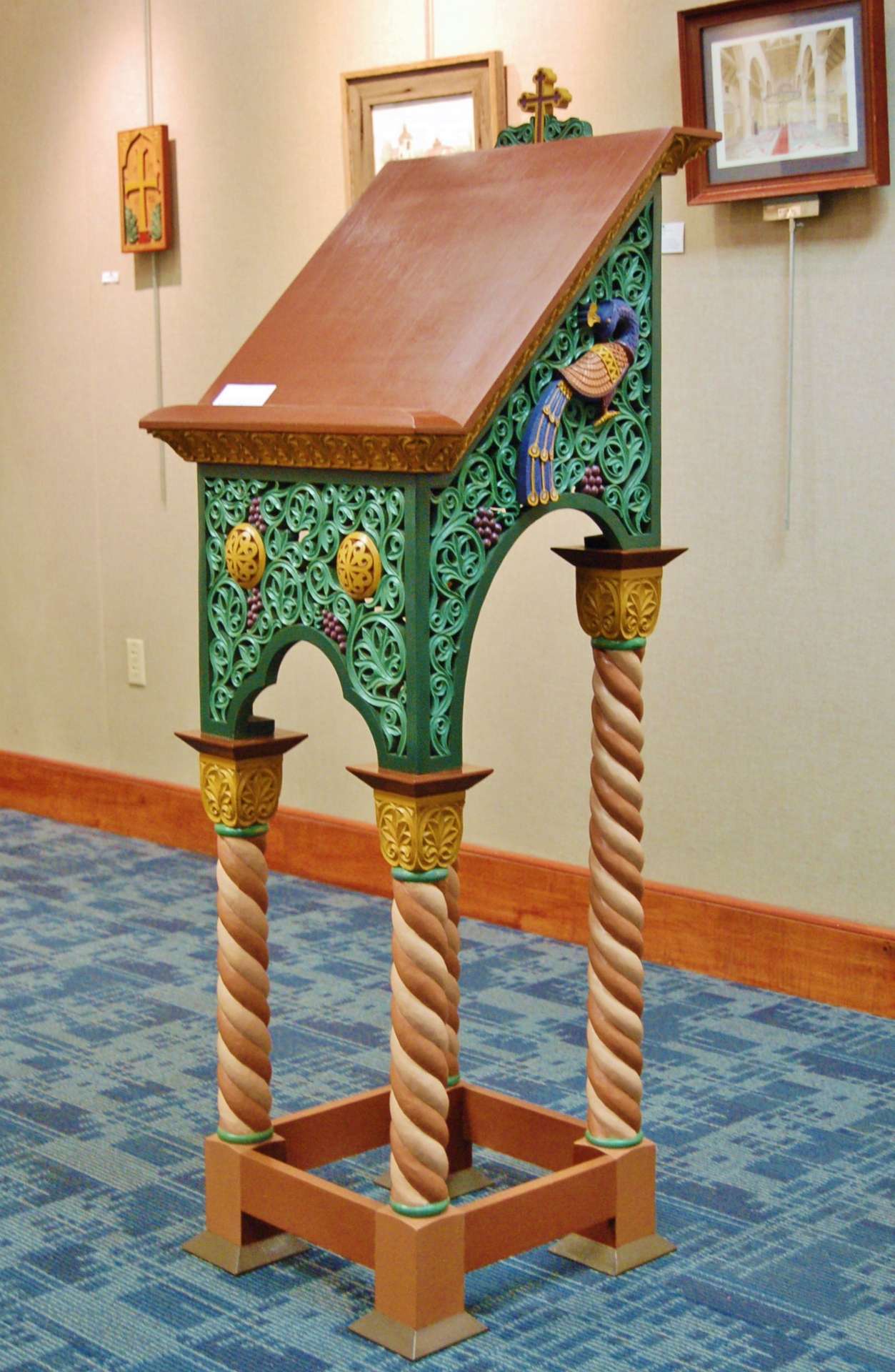
The analogion is currently on display at an exhibition of Andrew Gould’s liturgical art at the Charleston County Main Library in Charleston, SC – open through 7/31/15.
The following are some other examples of polychromed woodcarving made by the author:
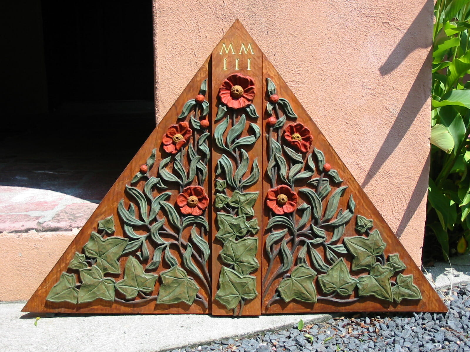
Gable panel for the entry porch of a new house, carved in white pine and painted by Andrew Gould
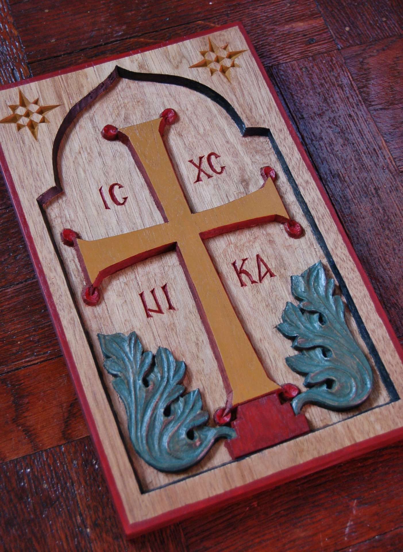
Byzantine cross, carved in butternut and painted by Andrew Gould
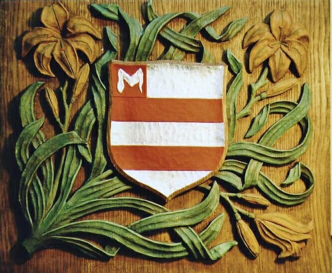
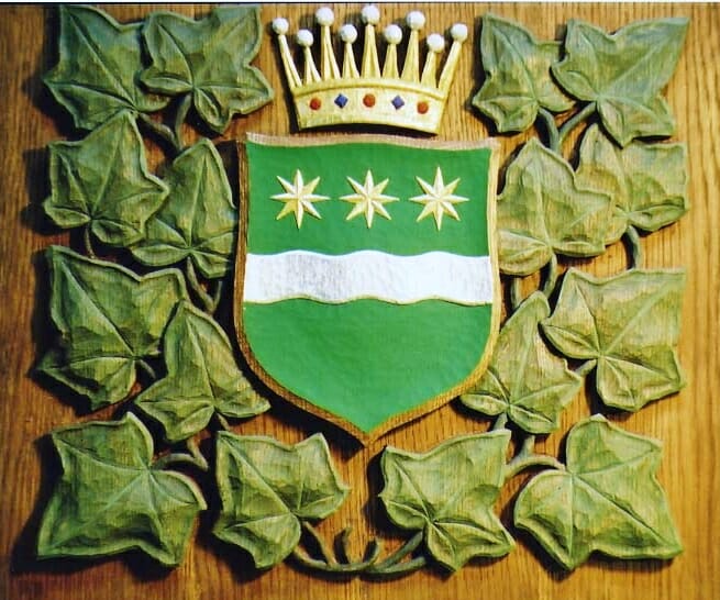
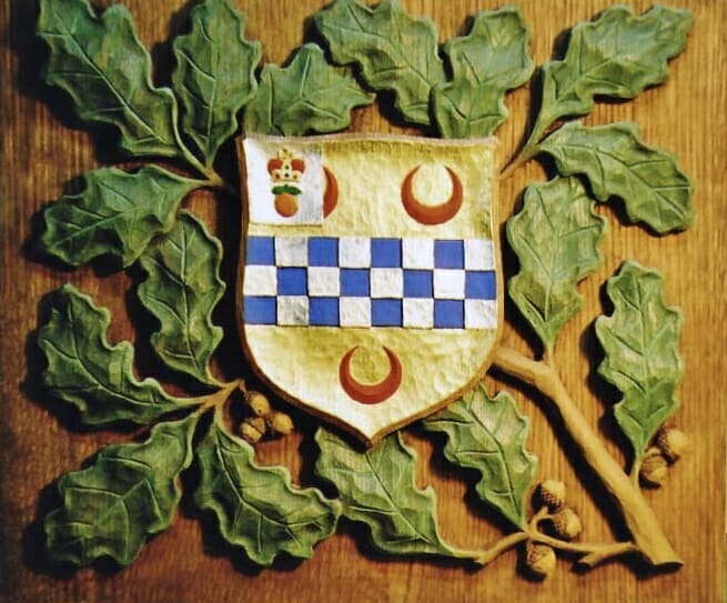
A set of three decorative panels for a fireplace surround, carved in white oak and painted and gilded by Andrew Gould
[…] Part Two of this article describes a recent project undertaken by Andrew Gould to apply polychrome to a Byzantine-style carved wood analogion. […]
In the Byzantine era, most people lived a common life with drab clothing and household goods. Beautiful colors and gemstones were reserved for the very wealthy or the very rich. And so, indeed, upon entering a byzantine church, they were struck by the beauty and the richness and the vibrancy of color, and the stark contrast between life on earth and the representation of the heavenly realm. As an artist, I could not imagine living or working without color. But in today’s world, the argument can also be made for the softness and the peace that one finds in a monochromatic piece. That piece that draws one in to further study before one can discover the nuances of it’s message rather than its medium. Compare Michaelangelo’s Sistine Chapel ceiling to that of his Pieta sculpture. There is great beauty and profundity in both, each according to its gifts. In this noisy world, there are times I long for simplicity, not that the designs are simple, by any means, but that the monotone gives the eye a kind of rest in traveling over the carved surfaces and valleys of the piece to appreciate the beauty of the craftsmanshipship that has been offered up to God, and that one can see the hand of God within. And, there is the eye of God within pieces with beautiful color. Thank God for both of these gifts.
Thank you for that perspective, Olga. Well said.
I think the coat of arms pieces shown above are more successful polychromed wood specimens than the analogion in that they honor the wood by revealing it with semi-transparent thinned layers over a grain that persists. Completely coating wood in opaque pigment rather seems to plasticize it, which is unfortunate in my opinion.
Painted wood certainly can look plastic and characterless, but that is why it’s important to do all this rubbing and waxing. It reveals a little of the wood underneath and gives a handmade feel to the surface. I like transparent polychrome very much also, but I’m not sure it would work well on an iconostasis, for instance, where the polychrome needs to match the icons.